Colour plays a powerful role in how people see and remember your brand. In 2026, businesses are not just choosing colours because they look good. They are using them to communicate personality, values and confidence in a crowded visual world.
Whether you are designing stickers, updating shop signage or investing in illuminated lightboxes, understanding current colour trends can help your brand feel relevant without losing its identity.
This guide explores the key colour directions for 2026 and how small businesses can apply them across print, design and marketing.
Table of Contents
What’s Shaping Colour in 2026
Colour trends reflect culture, technology and mood. In 2026, there is a noticeable balance between bold expression and grounded calm. After years of minimal palettes and muted neutrals, brands are leaning into colour with more intention.
Design forecasts show a shift towards warmer earthy tones paired with confident accent colours. At the same time, softer blues and subtle pastels remain popular for brands that want to feel trustworthy and approachable.
The overall direction is about contrast and harmony working together. Strong colours are supported by calming bases. Bright accents sit against natural backdrops. The result feels considered rather than chaotic.
Key Colours to Watch in 2026
Here are some of the standout tones influencing branding and print this year.
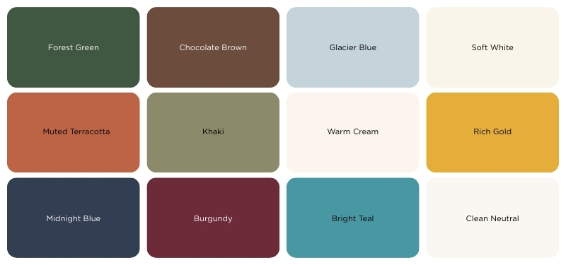
Earthy Browns and Greens -
Deep chocolate brown, forest green and khaki shades bring warmth and stability. These tones feel grounded and dependable, making them ideal for businesses that want to communicate reliability.
Calming Blues -
Glacier blue and soft mid tone blues remain popular. They create a clean and reassuring look that works well across signage and illuminated displays.
Muted Neutrals -
Warm off whites and subtle stone tones provide balance. They allow brighter elements to stand out without overwhelming the design.
Confident Accents -
Rich gold, deep burgundy and vibrant teal are being used as highlights rather than dominant colours. When applied sparingly, they draw attention to important information or calls to action.
These colours are not meant to be used all at once. The key is pairing a stable base with one or two strong supporting tones.
How Colour Shapes Brand Perception
Colour often communicates before words do. A cool blue suggests trust. A warm brown feels welcoming. A bright accent signals energy and confidence.
For small businesses, this matters. If you are designing window signage, updating menu boards or printing promotional stickers, your colour choices influence how customers feel about your brand within seconds.
High contrast improves readability, particularly for large format signage. Softer combinations can make interior spaces feel more inviting. Bold accents can guide attention to pricing, promotions or key messaging.
Rather than choosing colours based purely on trend reports, think about the message you want your business to send. Trends should support your identity, not replace it.
Colour in Branding vs Print & Marketing
Colour does not play the same role in every context. In branding, colour is long term. It needs to be recognisable, consistent and flexible enough to work across everything from your website to packaging and signage. A strong brand colour builds familiarity over time. It becomes something customers associate directly with your business.
Marketing campaigns give you more freedom. Seasonal promotions, new launches and limited time offers allow you to introduce trending shades without changing your core identity. For example, a business built around navy and white could introduce a bold teal or warm terracotta accent for a summer campaign across stickers, posters or promotional flyers. This keeps your brand feeling current while protecting recognition.
Print adds another layer of consideration. Colours on screen are backlit and often appear brighter. In physical print, ink interacts with paper, vinyl or acrylic. A tone that looks vibrant digitally may appear softer once produced, particularly on matte materials. Testing small print runs or physical samples can help ensure your final signage or promotional materials match expectations.
Understanding these differences allows you to use colour more strategically. Your brand colours provide stability. Your marketing colours create momentum. Your printed materials bring those choices into the real world.
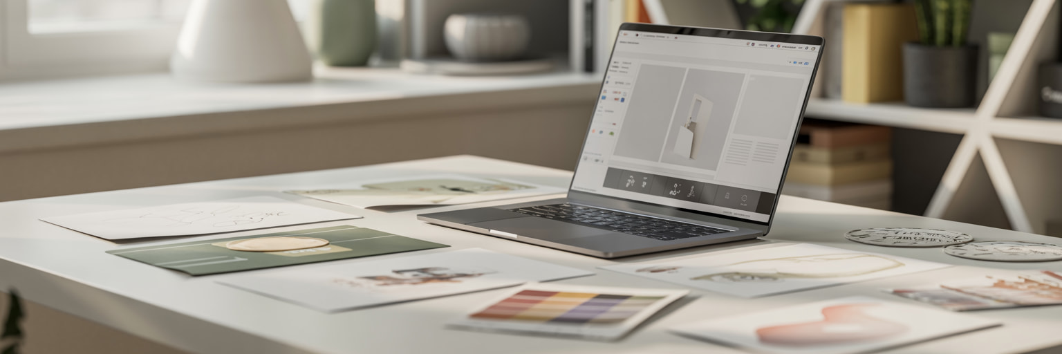
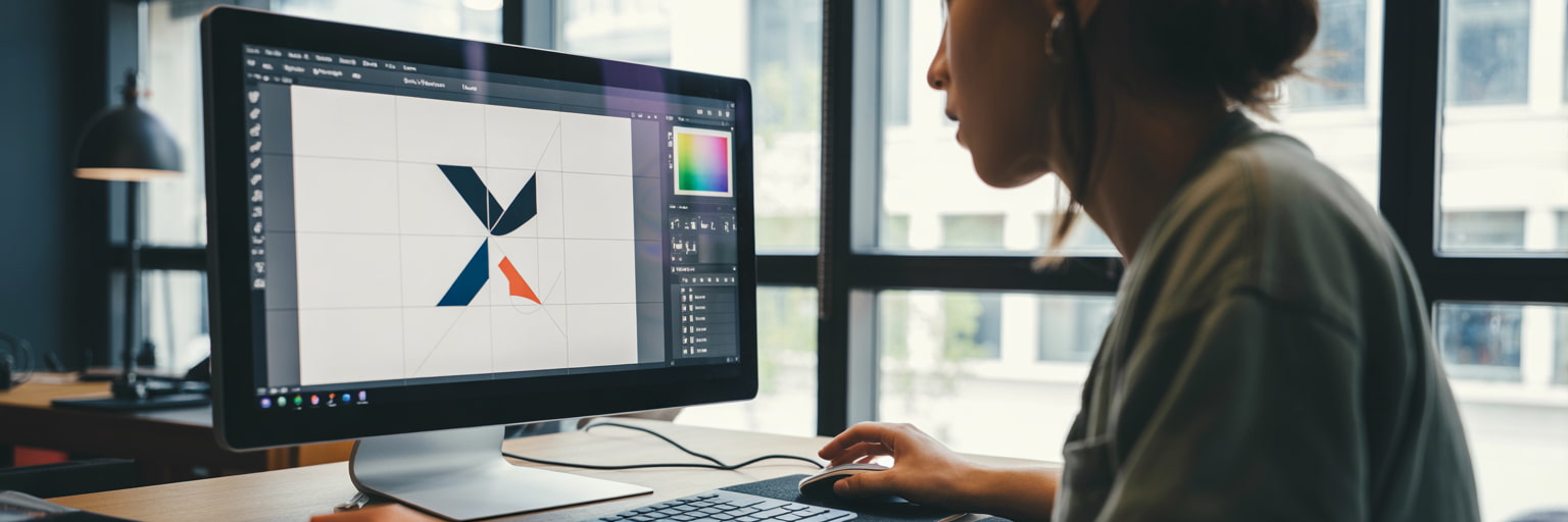
Applying Colour Trends to Print and Design
Translating colour trends into physical print requires a slightly different approach than digital design.
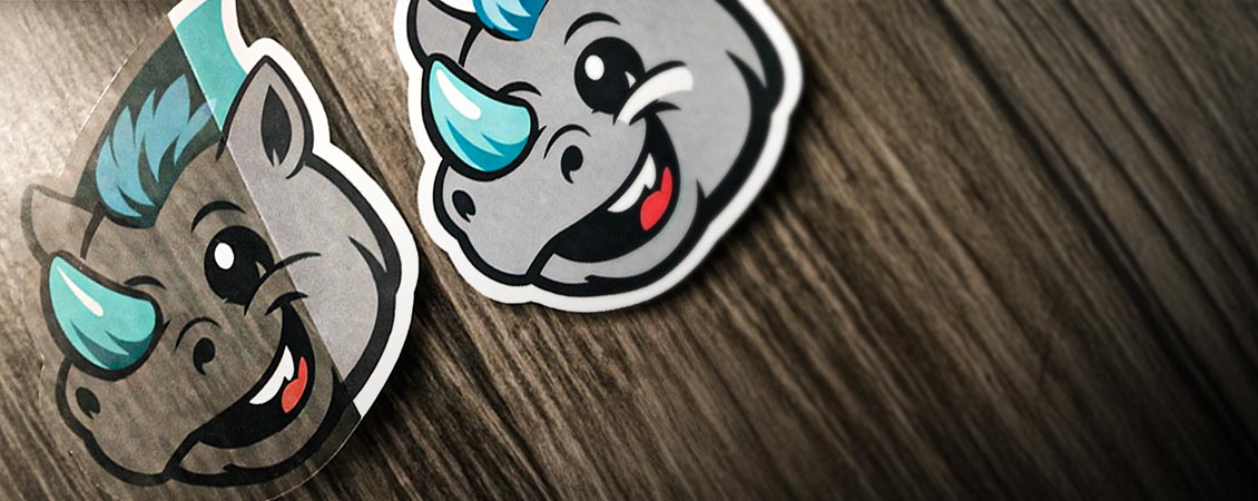
Stickers -
Bold accents work particularly well on stickers. A deep teal background with a contrasting gold detail can make small designs feel premium. Earth tones also photograph well for social media, which is useful if customers share your branding online.
Lightboxes -
Soft blues and warm neutrals are effective for illuminated lightboxes. Backlighting enhances lighter tones, creating a clean and professional appearance that feels modern without being harsh.
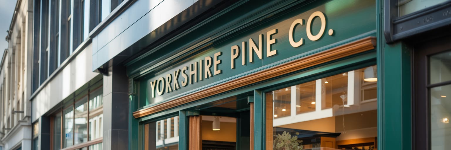
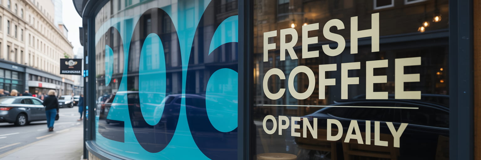
Signage -
For external signage, contrast is essential. Dark bases paired with clear lettering improve visibility from distance. Using a trend colour as an accent stripe or background panel keeps the design contemporary while maintaining legibility.
It is also important to test how colours translate from screen to print. Some bright digital shades may appear slightly different once printed, especially on textured or matte materials.
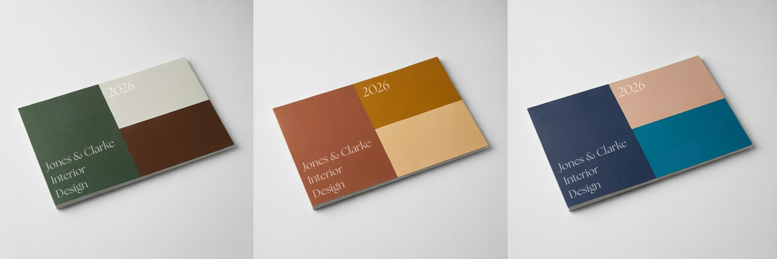
Starter Palettes for Small Businesses
If you are unsure where to begin, here are three simple palette directions inspired by 2026 trends.
Each of these combinations can be adapted for packaging, stickers, window signage or promotional materials. Start with one dominant colour, support it with a secondary tone and add a controlled accent for impact.
Bringing It All Together
Colour trends for 2026 are about balance. Grounded tones sit alongside confident accents. Calm palettes are lifted with moments of bold contrast. The aim is not to follow trends blindly, but to use them with purpose.
If you are refreshing your brand or planning new stickers, signage or lightboxes, begin with how you want your business to feel. Reliable, energetic, premium or playful. Let that guide your colour choices.
If you are struggling to find inspiration, tools like Coolors can help you experiment with palette combinations quickly. It allows you to generate and adjust colour schemes until you find a direction that feels right. Even if you do not use the exact combination suggested, it can help narrow your focus.
Trends should inspire ideas, not dictate them. Choose colours that feel current, but make sure they still feel like your brand.
.jpg)