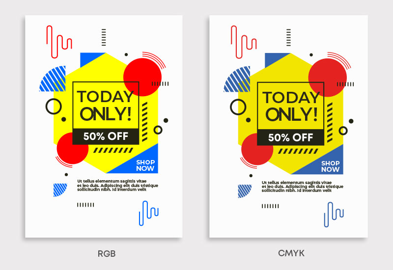
What is the difference between CMYK and RGB?
CMYK is the colour format that most commercial printers use to create their printed material. CMYK is made up of four ink colours, these are cyan, magenta, yellow and black. These colours are added to white paper until the desired colour is created.
RGB (red, green, blue) is the colour format used for digital displays like monitors, TVs, and smartphones. It creates colours by combining light, resulting in vibrant hues.
Do I need to do anything?
Our system automatically converts all colours to CMYK. If you are happy with how your artwork looks once your proof has been generated, you do not need to change anything.
How to set up and save a file in CMYK
To change your colour format to CMYK, you can usually do this in your program settings.
Adobe Illustrator and Adobe Photoshop
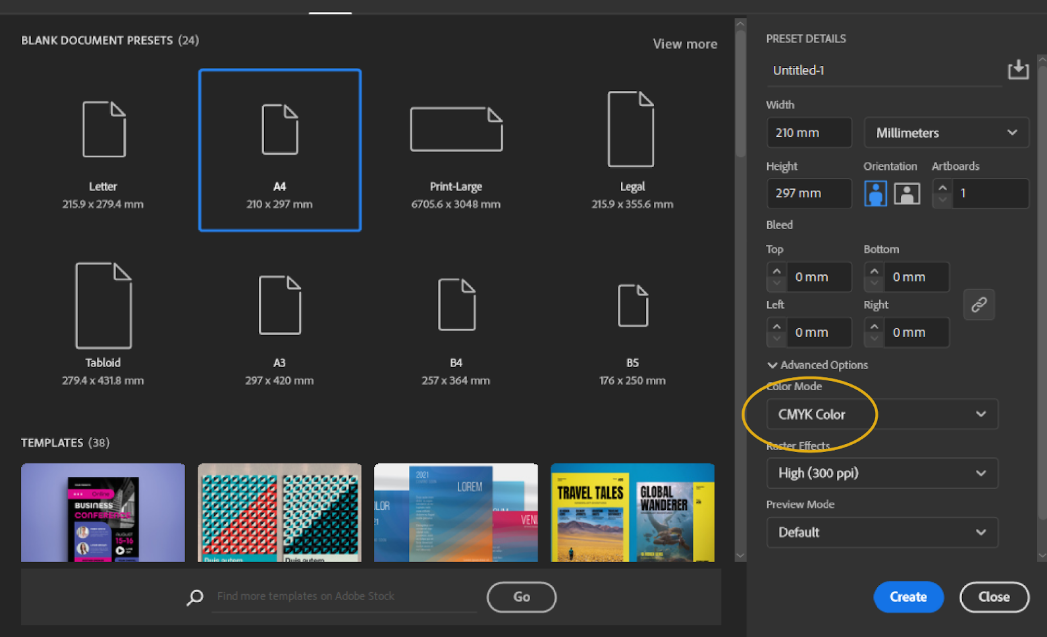
Create a new document, navigate to colour mode and select CMYK. When saving your file, go to Save as > PDF > Save > Adobe PDF Presets > High Quality Print.
Adobe InDesign
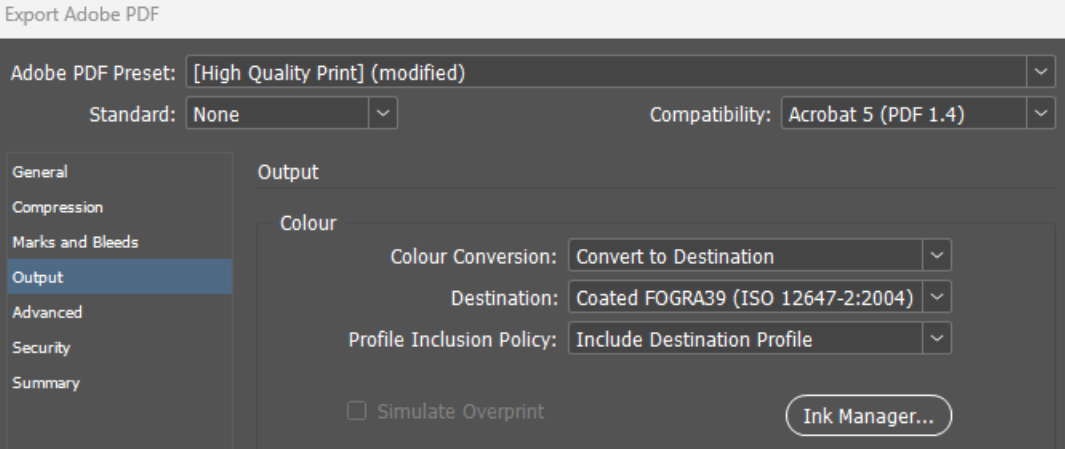
When creating a new file, navigate to the print tab and input your size. This will open a document that is set up in CMYK. Once your document is complete, go to Export > PDF > Save > Adobe PDF Presets > High Quality Print. Navigate to the ‘Output’ tab and then match the settings below. This will ensure that any imagery used in the document is also converted to CMYK.
Canva
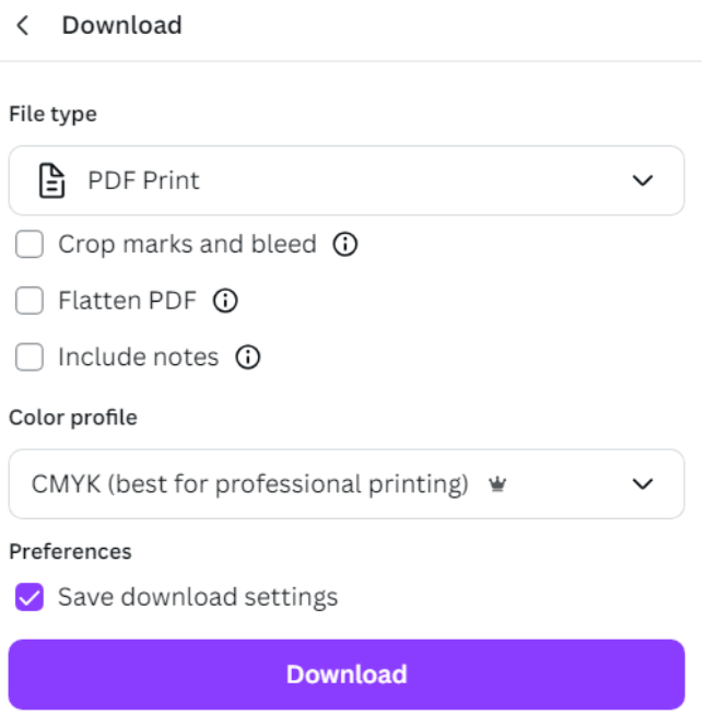
In Canva, you can ensure that your artwork is in CMYK by downloading your finished design as a PDF Print file and ensuring the colour profile is set to CMYK.
Microsoft Word, Microsoft Publisher, Microsoft PowerPoint
These programs save in RGB only. We’ll convert the artwork to CMYK, but please note that colours may vary.
Top Tips
-
Set up documents in CMYK to avoid conversion issues
-
Avoid saving documents as JPEG or PNG—they default to RGB, even if the file is set up in CMYK.
FAQ’s
Q: Why can’t I print my artwork in RGB?
A: RGB is used for digital displays, while CMYK is used for printed materials.
Q: Why has my artwork gone dull when converted to CMYK?
A: RGB colours are vibrant as they are produced with the addition of light. Some of these colours cannot be converted to CMYK.
Q: Can you change my colours for me if I am unhappy with them?
A: Unfortunately we don’t have an in-house design team so we would be unable to change colours. You will be able to adjust the colours yourself however using your design software.
Q: I have a brand Pantone colour which needs a CMYK value, how can I get this?
A: If you don’t have access to design software, you can use a Pantone Colour Bridge Guide. This is a physical guide that tells you the CMYK values of different Pantones. There are also some Pantone to CMYK converters online that may be helpful.
In Adobe’s design software, you can convert Pantones to CMYK as follows.
Adobe Illustrator:
- Select the object with the Pantone colour.
- Go to the Swatches panel.
- Double-click the Pantone colour in the Swatches panel.
- In the Swatch Options dialog box, change the Color Mode to CMYK.
- Click OK, and the Pantone colour will be converted to its closest CMYK value.
Adobe Photoshop:
- Open the file with the Pantone colour.
- Go to Image > Mode > CMYK Color.
- The software will automatically convert the Pantone colours to their closest CMYK equivalents.
Adobe InDesign:
- Select the object with the Pantone colour.
- Go to the Swatches panel.
- Right-click on the Pantone swatch and choose Swatch Options.
- Change the Color Mode to CMYK.
- Click OK. The software will convert the colour to its nearest CMYK value.
For any further help, please contact our team via chat or call 0191 27 27 327.