A logo is often the first thing people notice about a business. It appears on your website, packaging, signage, marketing materials and printed products, so it needs to work hard across lots of different formats.
At instantprint, we work with thousands of UK businesses, charities and creators who come to us at all stages of their branding journey. Some arrive with a polished logo already in place. Others are starting from scratch and want something simple that still looks professional.
This guide covers practical logo design tips and tools to help you create a logo that looks good, works in print, and grows with your business.
Table of Contents
What Makes a Good Logo?
A good logo does not need to be complicated. In fact, the most effective logos are often the simplest.
Strong logos tend to:
- Be easy to recognise at a glance
- Work at different sizes, from business cards to banners
- Look clear in both colour and black and white
- Feel appropriate for the type of business they represent
Before thinking about tools or software, it helps to be clear on what your logo needs to do. Is it bold and attention grabbing, or calm and professional? Is it aimed at consumers, other businesses, or a local community?
Start with the Basics
Before opening any design tool, take a moment to define a few basics.
Ask yourself:
- Who is this logo for?
- Where will it be used most often?
- Should it feel modern, traditional, friendly or formal?
Having simple answers to these questions makes design decisions much easier later on.
![]()
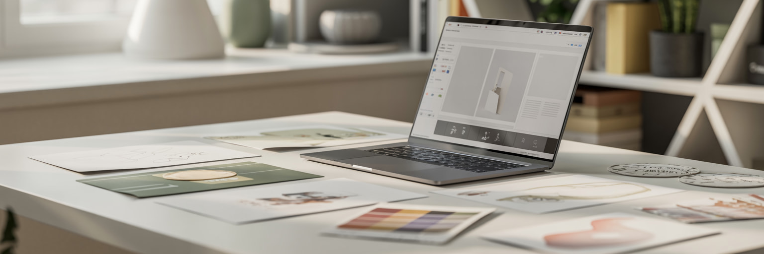
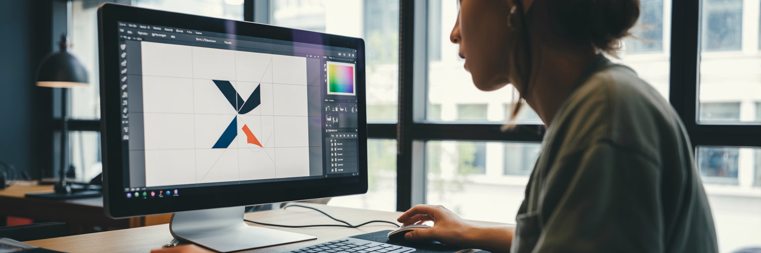
Logo Design Tools to Consider
You do not need to be a trained designer to create a usable logo. There are plenty of tools available, depending on your confidence level and budget.
-
Online Logo Makers
Online logo tools are ideal for beginners or businesses that want a quick starting point.
These tools typically offer:
- Ready made templates
- Simple font and colour controls
- Export options for basic logo files
They are easy to use, but designs can sometimes feel generic. If you use one, try to customise fonts, colours and spacing so your logo feels more personal.
-
Design Platforms
Design platforms give you more control while still being relatively accessible.
They are useful if you want to:
- Build a logo from scratch
- Adjust layout and spacing more precisely
- Create different versions for print and digital use
These tools take a little longer to learn but often result in a more flexible logo.
Some tools to consider are Canva, Photopea, or our very own instantprint online design tool.
-
Professional Design Software
Professional software offers the most control and precision, especially for logos that need to scale perfectly.
This option is best if:
- You are working with a designer
- You want full control over shapes and typography
- You plan to use your logo extensively in print
If you go down this route, make sure you keep editable files as well as finished versions.
The main, industry leading design software to research would be Adobe Creative Cloud, CorelDRAW or Affinity.
Typography Tips for Logos
Typography plays a huge role in how a logo feels.
A few practical tips:
- Choose fonts that remain readable at small sizes
- Avoid using too many fonts in one logo
- Think about how your font choice reflects your brand personality
As we cover in our guide to serif and sans serif fonts, some typefaces feel more traditional and established, while others feel modern and clean. There is no right or wrong choice, as long as it fits your brand.
Colour Choices That Work in Print
Colour is one of the most common areas where logos run into problems, especially when moving from screen to print.
When choosing colours:
- Start with one or two main colours
- Make sure your logo still works in black and white
- Avoid very light colours that may not show up well when printed
It is also worth checking how your colours look on different materials, such as paper, stickers or packaging.
![]()
Design with Print in Mind
A logo that looks great on screen does not always translate perfectly to print.
To avoid issues:
- Test your logo at different sizes
- Check fine details are still visible when scaled down
- Make sure text and symbols are not too thin
At instantprint, we often see logos that need small adjustments before printing, such as thicker lines or simplified details. Designing with print in mind from the start saves time later.
Keep It Simple and Flexible
One of the most common mistakes in logo design is trying to include too much.
A good logo should be:
- Easy to place on different products
- Clear whether it appears on its own or with text
- Flexible enough to work across future designs
Many businesses find it helpful to have a few versions of their logo, such as a full version, a simplified icon, and a text only option.
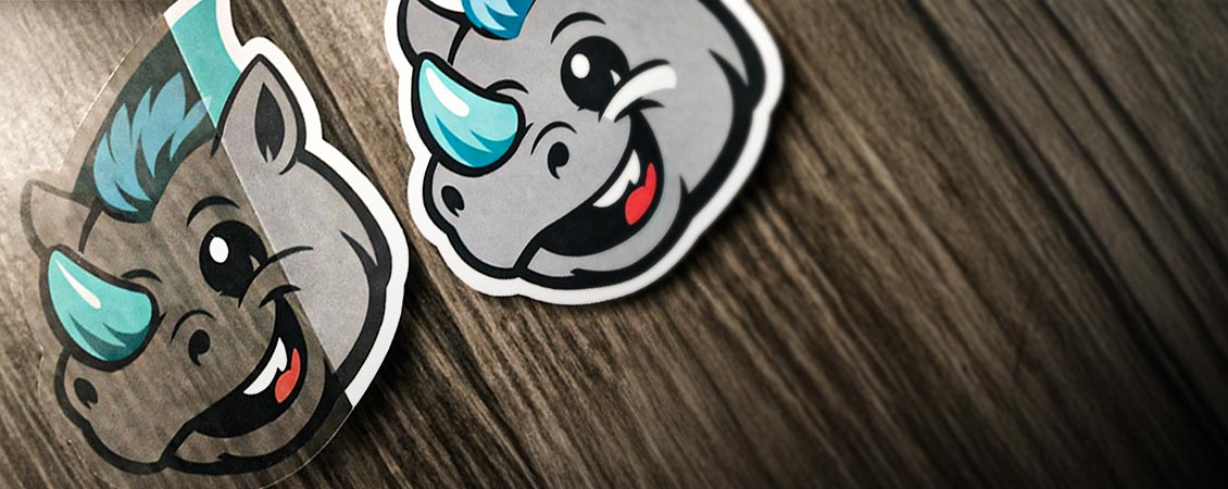
Test Before You Commit
Before settling on a final logo, test it in real situations.
Try placing it on:
- A business card
- A flyer or folded leaflet
- A sticker or label
- A large sign
- A website header
Seeing your logo in context often highlights things that are easy to miss on screen.
![]()
Logo Design Trends in 2026
While the fundamentals of good logo design stay the same, design trends continue to evolve. In 2026, logos are being designed with clarity, flexibility and digital use in mind, helping businesses stay consistent across print and online platforms.
-
Simpler, cleaner logos
Minimalist logo design remains popular, with businesses choosing fewer colours, cleaner shapes and clear typography. Simple logos are easier to recognise and work better at smaller sizes, such as on social media or mobile screens.
-
Flexible logo systems
Many brands now use multiple logo variations, such as a full logo, a simplified icon and a text-only version. This makes it easier to use logos across signage, websites, packaging and social media.
-
Typography-led design
Strong, confident typography continues to play a bigger role in logo design. Well-chosen fonts can communicate personality and professionalism without the need for complex graphics.
-
Muted, print-friendly colours
In 2026, many logos use softer, more natural colour palettes. These colours feel modern and tend to reproduce more consistently across different print materials.
Trends can be useful for inspiration, but your logo should always reflect your business and work for the long term, rather than following fashion alone.
And don't forget...
Logo design does not need to be intimidating. With a clear idea of your brand, the right tools, and a focus on simplicity, it is possible to create a logo that looks professional and works across print and digital.
At instantprint, we see every day how a well designed logo helps businesses present themselves with confidence. Taking the time to get it right at the start makes everything else, from marketing to packaging, much easier down the line.
.jpg)