Choosing a font might seem like a small design decision, but in print it plays a huge role in how your message is read, understood and perceived. The right typeface can make your design feel professional, trustworthy and clear, while the wrong one can make it hard to read or send the wrong message about your brand.
One of the most common questions people ask is: “Should I use a serif or sans serif font?” In this guide, we’ll explain the difference between the two, explore when each works best in print, and help you choose the right option for your next print project.
What Is a Serif Font?
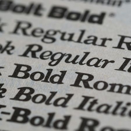
Serif fonts are typefaces that have small decorative strokes, known as serifs, at the ends of letters. These strokes originated from traditional printing and stone carving and are often associated with classic typography.
Common serif fonts include:
- Times New Roman
- Garamond
- Baskerville
- Georgia
Serif fonts are often described as traditional, formal or trustworthy. They’re widely used in books, invitations, and long-form printed materials because the serifs help guide the eye along lines of text.
What Is a Sans Serif Font?
Sans serif fonts don’t have the decorative strokes at the ends of letters. The word sans literally means “without”, so sans serif means “without serifs”.
Popular sans serif fonts include:
- Helvetica
- Arial
- Open Sans
- Montserrat
Sans serif fonts tend to feel modern, clean and minimal. Their simple letterforms make them highly versatile and especially effective for bold headlines, signage and contemporary branding.
Serif vs Sans Serif: What’s the Difference in Print?
While both font styles can work beautifully in print, they each excel in different situations.
Readability
- Serif fonts are generally easier to read in long blocks of printed text, such as brochures, magazines or booklets. The serifs help guide the reader’s eye from letter to letter.
- Sans serif fonts are very clear at larger sizes and work well for short bursts of text, headlines and calls to action.
Tone and Personality
- Serif fonts often feel established, elegant or authoritative.
- Sans serif fonts feel friendly, modern and straightforward.
Space and Layout
- Serif fonts can feel more compact and traditional, making them suitable for dense layouts.
- Sans serif fonts usually feel more open and airy, which works well in clean, minimalist designs.
When to Use Serif Fonts in Print
Serif fonts are a great choice when your print design includes a lot of reading or needs to convey credibility and tradition.
They work particularly well for:
- Brochures and booklets
- Magazines and newsletters
- Menus with longer descriptions
- Luxury or heritage branding
If you’re printing something that customers will spend time reading, a serif font can help make the experience more comfortable and refined.
When to Use Sans Serif Fonts in Print
Sans serif fonts shine when clarity and impact are the priority. Their simple shapes make them easy to read at a distance and at smaller sizes.
They’re ideal for:
- Posters and signage
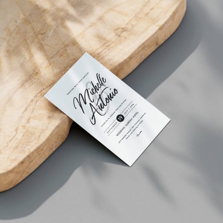
- Business cards
- Flyers and leaflets
- Price lists
Sans serif fonts are also popular for bold headlines and promotional messaging because they feel confident and direct.

Can You Mix Serif and Sans Serif Fonts?
Yes! And when done well, it’s one of the most effective ways to create a balanced print design.
A common approach is:
- Serif font for body text
- Sans serif font for headings and highlights
This combination creates contrast, improves readability and helps guide the reader through the design. The key is to keep things simple: choose one serif and one sans serif font that complement each other, rather than mixing multiple styles.
Print Specific Tips for Choosing Fonts
When designing for print, keep these extra considerations in mind:
Small text matters
Thin or overly decorative fonts can lose clarity when printed, especially at small sizes.
Paper and finishes affect legibility
Heavily textured stocks or dark backgrounds can make fine details harder to read. Clean, well spaced fonts work best.
Always proof your artwork
Fonts can look different on screen compared to print. Checking your proof helps ensure spacing, weight and clarity are spot on.
Avoid overcomplicating your design
Two fonts are usually enough. Too many styles can make your print feel cluttered and inconsistent.
Serif or Sans Serif: Which Should You Choose?
There’s no single “right” answer - it all depends on your content, audience and brand personality.
As a rule of thumb, you’ll likely want to choose serif fonts if you want to:
- Communicate tradition or professionalism
- Print long-form text
- Create a classic or premium feel
Or choose sans serif fonts if you want to:
- Keep things modern and minimal
- Create bold, eye-catching designs
- Improve clarity for short messages
Both font styles can produce high quality, professional print when used thoughtfully.
Conclusion
Serif and sans serif fonts each bring their own strengths to print design. Understanding how they differ and where they work best helps you make confident choices that improve readability and reinforce your brand.
Whether you’re creating flyers, business cards, books or posters, choosing the right font style ensures your message is not only seen, but enjoyed. With a clear purpose and a considered approach, your typography can elevate your print from good to great.