(1) (1).png)
Whether you’ve got a quick-coffee-on-the-run café or a gourmet Michelin star restaurant, your hospitality business is nothing without a good menu. We’re not just talking about the food, of course: how your menu looks is a vital element in helping your customers make the tastiest decision of the day.
A well-designed menu can even ensure customers spend more than they intended! For example, a sleek menu with offers of 3 for 2 or ‘side upgrades’ (sweet potato fries, anyone?) is so tempting for hungry people - you’ll soon see an increase in at-table upsells. It’s really that easy.
Here are our top tips to creating a tempting menu for your restaurant:
1. Use Hungry Colours

They exist! Colour psychology is an interesting area of research. For instance, Twitter, LinkedIn, and Facebook are blue because that’s the most sociable colour. Fast food restaurants use bright colours such as red to slightly unsettle you and create a sense of urgency – so you don’t languish in their plastic seats. Red also stimulates the appetite, making you hungry before you even think of ordering.
Hungry colours are those which stimulate the appetite – making them perfect to highlight the important elements of your menu. If you want to push a particular salad deal, for example, a green highlight will emphasise how healthy the deal is – and stimulate the reader’s appetite. Other colours include turquoise, orange, and yellow. These colours make people feel happy, relaxed, and open to suggestion – such as buying those extra fries!
Pick one or two colours at most, to make sure your menu design stays sleek and professional, without looking cluttered. A minimal palette is a great way to bring branding and cohesion to your menu in a way that doesn’t get too ‘in-your-face’ while your customers read it.
2. Simplicity And Space
Space is your friend. While a crammed menu provides lots of choice, it actually makes it harder to make that decision. The longer it takes to read a menu, the hungrier you get and the less satisfied you’ll be with your final decision as you panic-choose when the waitress comes over for the fifth time.
Try minimising the choices available for each course and you’ll empower your patrons. Being able to make a quick decision makes for a more positive experience for hungry customers, rather than spending ages trying to choose from lots of options.
Reflect this simplicity with your design: minimal images, clean lines, and easy-to-read typefaces are all top ways to make your menu stand out.
3. Clear Sections
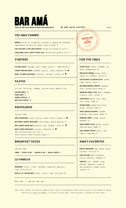
Image: www.underconsideration.com
When designing your menu, think about how you like to read one and consider how your eye moves over the page. Whether you’ve gone for a double-sided A4 menu, or a tri-fold leaflet, make sure the flow of each section makes sense to the way you naturally browse a menu.
Consider what you would order together: sides of fries with grilled chicken, for example, or coffees with your dessert. Create clear sections that flow one to the other, and can easily be navigated with headings.
Make suggestions, too: use boxes or similar graphic design elements to highlight perfect pairings. If you think a certain wine will go well with a fish dish, say so! If you think the best thing to follow your prawn cocktail starter is the pulled pork burrito, highlight it!
4. Consider Your Folds
If you’ve chosen to have a folded menu, remember to take the crease into account. Any pictures, graphics, or text might get lost if you place them over a fold.
In addition, most text over a fold in a menu is likely to make it feel cramped: a folded menu is a perfect opportunity to create your clear sections, without running onto the next page.
5. Use Images (Sparingly)
Photos of tasty food can work really well for stimulating the appetite. There’s a reason people Instagram their dinner! Pick a couple of your best, most presentable dishes, and include photographs of them on your menu.
Tempting as it may be to include lots of photographs, don’t! You still need lots of clear space and uncluttered design to help customers make their decision. A few well-placed graphics can lift a design from the mundane to the delicious, but too many can confuse the customer and cause sensory overload.
6. Use A Clear Font
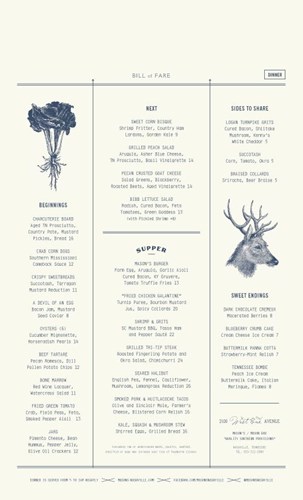
Image: www.underconsideration.com
Even if you’re a restaurant that specialises in kid’s birthday parties, try to avoid ‘wacky’ curly fonts. A menu needs to be easy and quick to read, so consider using simple fonts so that anybody can glance at your menu and make a decision in a few seconds.
The same goes for the colour of your font: some colours, such as red, are harder to read. Cater to as many customers as possible by using a colour (such as black or dark brown) that is easy to read – your hungry colours can be included in the graphic elements, instead!
Now you've got the design tips down, all that's left is to create your own stunning restaurant or takeaway menu! Share your menu design with us on Instagram and Twitter by tagging us @instantprintuk or #instantprintuk for a chance to be featured.