(1).png)
Much like colour, the fonts you use in your branding can communicate a lot about your business. So, how do you choose the right one? We did some research to understand how different fonts make an impression on the viewer, and how to use that to your advantage.
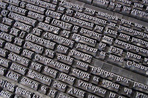
https://pixabay.com/en/font-lead-set-book-printing-705667/
The importance of choosing the right font
As soon as a customer is presented with a piece of visual branding, they make instant judgements on that company. We subconsciously question what the visuals in front of us mean and make instantaneous decisions. This can be based on our innate psychology, past experience with brands and the promotional materials that surround us in everyday life. What do other brands with this kind of font do? What do we associate with them? For example, if you see a logo with a swirling script style font, you may think of luxury, elegance and tradition. Whereas a bold font may remind us of more serious, hard-hitting brands.
Types of fonts
Fonts are broken down into four main style categories – Sans fonts, Slab fonts, Script fonts and Serif fonts.
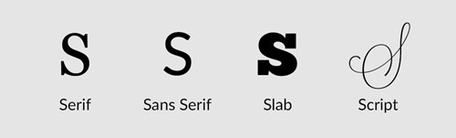
Serif fonts are fonts with decorative lines added to the ends of each character. This style of font is often used in large bodies of text as it is considered to be easier to read. However, serif fonts are used the least in logos, but were most famously used by Google.
Sans fonts are fonts that do not use serifs, such as Helvetica and Arial. Of all the fonts under the ‘Sans’ umbrella, Helvetica seems to be the most widely used. However, this is likely to change soon as creatives search for something different!
Slab fonts are characterised by their used of bold serifs. Examples of slab fonts include Rockwell and Courier. The famous Yahoo! Logo is designed using a slab style font.
Script fonts are based on the flowing style of elegant handwriting. Commonly used by brands such as Coca Cola and Ford.
How do fonts communicate?
Whether you have considered it or not, the font you use will communicate something about your brand. With so much variety out there, it is important to contemplate what you want your customers to think and feel when presented with your font. To begin, it would be helpful to look at your competition and see what fonts they are using.
For example, when choosing a font for a travel agent, we could look at the popular brands Thomson, Thomas Cook and STA Travel.
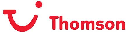
Thomson opt for a sans serif font in a bold red, complete with a simple image to the right of the company name. This font is simple and fairly serious, with the rounded chunky letters giving it a touch of fun. This is perfect for Thomson as they mostly sell family holidays – the customers are reminded that booking a holiday is fun, but also reassured that Thomson can be trusted to take care of all the logistics involved.
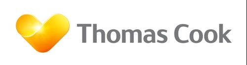
Thomas Cook’s logo is very similar to Thomson; however, they remain individual with their choice of colour. The slightly less rounded lettering gives more of a feeling of relaxation and sophistication. Perhaps Thomas Cook look to target a market of people looking to relax, whereas Thomas target holidaymakers with young families. This lettering teamed with the almost sunset effect of the yellow logo instantly makes the viewer think of their next holiday. Interesting when you consider how similar the fonts look at a first glance!
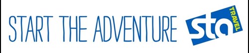
STA travel again use a sans serif font for their logo. However, they opt for a very simplistic lettering. The lower-case letter ‘s’ flows seamlessly into the ‘t’, complete with a relaxed curl of an ‘a’. The word ‘travel’ is then represented in block capitals. This logo says modern, fun and serious about travel. It is often seen alongside their slogan ‘Start the Adventure’. Here, this is shown in thin, slightly wobbly letters. These shaky characters could suggest the excitement and perhaps the nerves involved in booking one of their interactive tours around South-East Asia or New Zealand. A perfect way to represent their brand and cater to their audience of young adults.
Emotion and association
Simply looking at a font evokes emotions and memories within us. When faced with a visual cue such as a font, our minds will subconsciously bring up memories of similar visuals we have seen in the past. Any emotion experienced in these memories will therefore arise again when we are faced with the visual cue – often on such a minor level that we can’t understand why we ‘just don’t like’ something! Emotion plays a big part in decision making, so anything that can evoke emotion is a useful tool in marketing.
Our brains work by association. We associate the colour red with urgency and the colour blue with tranquillity, and it’s a similar story with fonts. When we see a classic serif style font we may think of text books or novels, depending on our memories of similar lettering. Likewise, when we see ornate script style fonts we may think of a brand like Coca Cola or a luxurious hotel we once stayed in.
Font becomes even more complex here, as we need to understand our target market’s preferences to know which fonts will work for them. Obviously, we cannot know each one of our customers on a personal level, so looking at our competitors is a valuable activity.
Size and Spacing
Other aspects to consider when choosing a font for your brand is the size and spacing you use. Extremely large lettering can grab the attention of the viewer and get your message across instantly. Whereas a small font surrounded by a lot of blank space can work much in the same way as a whisper – intriguing your viewer and drawing them in closer to find out more. Ask yourself, is your brand bold and out there or quiet and gentle? Do you want your brand name to shout or to whisper?
Size is something to consider when it comes to readability as well. Choosing a font for your logo is the main challenge, however, analyse what sort of font would be best to use in blocks of text on your website or printed materials. This font should be easy to read while still working well with your main logo.
Spacing between letters can also be used to profound effect. This spacing can be used to represent how the brand name should be said. Adding more space can create a relaxed feel, causing the viewer to read the word slowly. Whereas, letters very close together can cause your viewer to say the brand name quicker, thus making it seem exciting, fast-faced, or urgent.

https://pixabay.com/en/acoustic-guitar-advertising-artist-1840381/
Using fonts to your advantage
Analysing what you want to say about your business, understanding your audience and researching your competitors are great first steps to choosing a suitable lettering. We asked some entrepreneurs and business owners for their insight on how to choose a font. Web designer Charlotte O'Hara gave her advice;
“You'll get the most out of your typography when you keep your ideal customer or audience in mind. If your audience is more corporate or business oriented, you will pick a font that is classic and formal. This wouldn't necessarily be the case if your audience is more creative since they might respond well to a font choice that is new and a little different. Keep your audience in mind and think about what THEY would want to see, not just what your personal preference is.”

https://pixabay.com/en/coca-cola-bottle-beach-retro-821512/
Charlotte’s advice is particularly useful as it reminds us not to let our personal taste effect the font we choose. Although we should choose a font that we like, it has to be for the right reasons. Decide on a font because of how well it works for the company, not simply because it’s similar to your personal style. We must also consider how our chosen font will work across different media. Mara from Sunbird Creative spoke to us about choosing a font for a company letterhead;
“Imagine someone receiving your letterhead: how do you want them to feel when they hold your company's document in their hands? Do you want the stationery to be completely non-distracting so that they only pay attention to the contents? Or do you want the stationery to make them smile? Or do you want them to be impressed by your business' clear emphasis on creativity? Knowing the answer to that question is half the battle. Once you have a clear idea of how you want people to respond, you just have to either find a designer who can achieve that for you, or look on stores with templates that match your requirements.”
Deciding on a typeface can be a hugely challenging task. However, we hope this post has helped guide you towards a decision. Do you have a great example of font use that you’d like to share? Stuck for a font to use for your own branding? Let us know on Facebook or Twitter!