
Stylistically, a font can say as much about your company as the clothes you wear or the music you listen to says about you. If you want your print work to stand out in the modern era of brand communications, you’ll struggle to make an impression if your chosen fonts are the typeface equivalent of flared trousers and Village People vinyl.
Your company should commit to a choice of fonts that represents your values and the way you want to be perceived by your customers. In print, on your website and in your customer communications, the font you choose is a major part of your day-to-day branding.
Where some companies are able to adapt to trends and let their font do the talking, others have missed the mark and struggle to effectively present themselves as a serious option when let down by their typeface.
But what are these style trends, and how can your business best present itself through the use of fonts? Here, we present some examples of fonts popularised in the decades gone by.
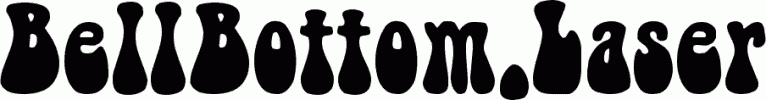
Whether used in the original wave of psychedelic pop culture, or during the brief 90s revival on film posters featuring Austin Powers, the bell-bottomed style of font is most assuredly 1970s. Calling to mind the days of disco, it’s absolutely a suitable choice if you’re targeting a retro audience, but fails to pass muster when touting the thoroughly modern sentiments of your tech-savvy targets.


.jpg)