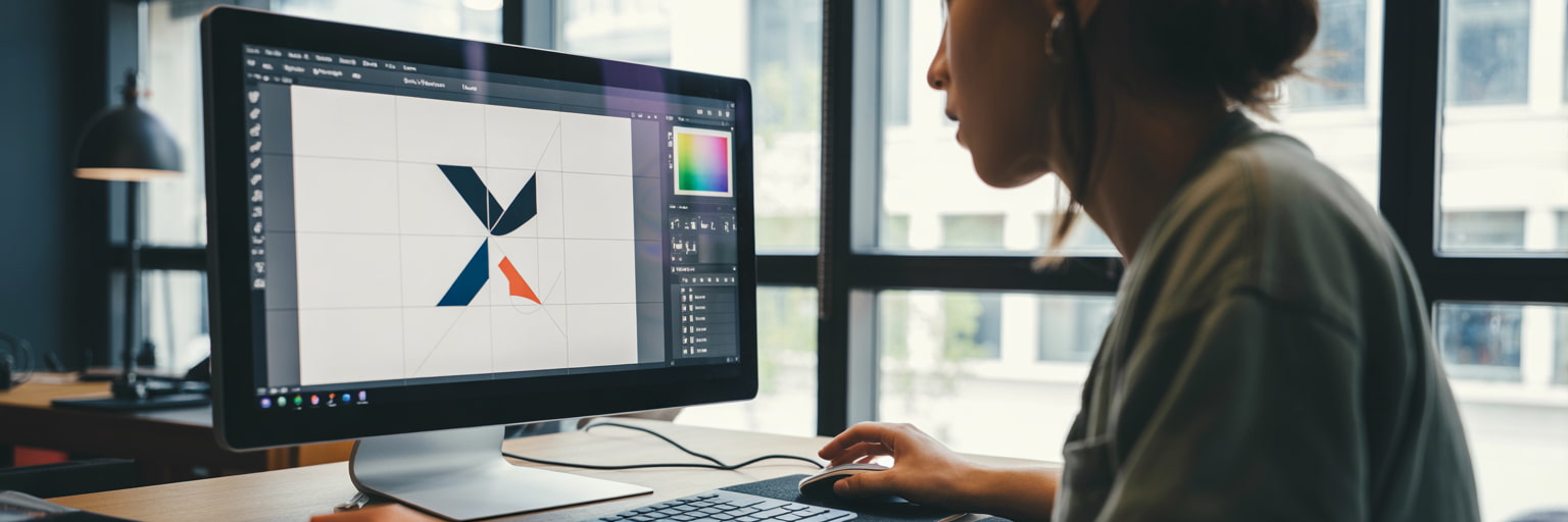
You don’t need us to tell you, letterheads are so important for your business. Not only are they a great way of growing brand recognition, they’re also necessary in a range of situations, like for invoices and formal letters. This can make the design process seem a little scary. But don’t worry, we’ve gathered all our top letterhead design tips to show you the best practice for your artwork.
Plan Ahead
Before you even think about getting your letterheads printed, you’ll need to go back to basics with a plan. Figure out whether you want a header or footer (or both), where your logo will go and whether you want contact details at the top or bottom of the page.
Think about how this will all look once you’ve printed your letter content onto the design too!
Colour
You might have heard advice telling you to stick to black and white letterhead designs so your office printer doesn’t lower the quality of the final letter. However, the best way to create quality letterheads is to get them printed professionally, then pop them in your office printer just for the main content. That way, you can choose any colour you want, knowing it’ll always look high quality.
When it comes to picking a colour, you have a couple of options:
- Go monochrome – I know, we said you don’t have to use black and white. But it can still look really effective!
- Use your brand colours – you already know your brand colours look great together, and it’ll help reinforce your brand in your clients’ minds.
- Pick an accent colour – you don’t have to use all your brand colours. Pick one that contrasts well with black and white to add subtle flicks of colour to your letterhead design.
Not decided on your brand colours yet? Here’s how to pick a winning colour palette for your brand.
Shapes
Sometimes it can be hard knowing where to start – you don’t want your letterhead to be boring or – even worse - unremarkable. But at the same time, you can’t let the design overshadow the actual letter content.
If you’re currently in this dilemma, we’d recommend playing around with some simple shapes and lines. Using your chosen design software, drag and drop shapes onto the page. You could have them at the top, on the sides, right up the edge of the sheet – it’s completely up to you. This way, you’re creating an eye catching letterhead design without distracting readers from the message.

(Source: CIPMANN)
However, we would recommend keeping them out of the middle of the page. Dark shapes especially can make the letter difficult to read.
Positioning
Visual hierarchy is a term used in graphic design to describe the arrangement of different design elements in order of importance. This is key for creating a letterhead that shows the right information effectively.
Best practice dictates that the business’s logo should go at the top of the page (hence the term letterhead). This is an important design element because it shows who the letter is from.
Top Tip
If you’re a graphic designer, never show the client a blank letterhead design as it can be hard for non-designers to visualise how it will look in use. Add placeholder text to show how it will look once the letter has been printed out on the stationery.
Then leave a big blank white space for the actual letter. This is the second piece of information you want to show as this is the reason you’ve sent the letter.
Contact details normally go at the bottom of the page, in case the recipient needs to get in contact with the company after reading the letter.
Keep it Simple
If it’s a cliché, then it’s probably true – and that’s definitely the case for the saying ‘less is more’. The key to an effective letterhead design is keeping it simple. Like we said before, the star of the show is the actual letter – the letterhead is the decorative frame.
The design below by Creative Director Tim Jarvis is a perfect example. A simple border encases the letter’s message. The logo and contact details are at the top and bottom of the page respectively, and there’s nothing to obscure the text.

(Source: Tim Jarvis)
What Information to Include
Depending on the type of business and communication, you’ll need to display certain information.
Here’s what must be included on every letterhead according to The Companies Act:
- Your business’s name
- Where in the UK your business is registered
- Your registered company number
- The address of your registered office
Here’s a full list of legal requirements for what to put on a letterhead depending on the type of business you’re designing for.
More recently, it’s also been common to put social media handles alongside the other contact details. Although not a requirement, this is a nice touch for businesses who use social media as their core marketing channel.
Match Your Business Stationery
You should always match your stationery designs by using your company brand guidelines. Not only is it best practice, but it’s also awesome for boosting brand recognition.
When we say stationery, we mean your other corporate communication tools like business cards and compliment slips.
Here’s a nice example of consistent branding across a full set:

(Source: Kempeli)
Use Design Software You’re Comfortable with
If you’re a small business owner looking for an easy way to create DIY letterhead designs, you’ve come to the right place. We’ve got loads of free letterhead templates you can customise online.
Start from scratch and design with our free letterhead maker, or choose a ready-made design. Either way, it’s easy to create professional designs for your business stationery.
Remember to share your finished designs with us on social media! Tag us @instantprintuk or #instantprintuk for a chance to be featured on our channel.

 (1) (1).png)


.jpg)