.jpg)
One thing all posters should have in common is an impactful design. And there’s a science behind effective poster design! Yes, your poster might look good, but in order to hold the attention of the viewer, it has to evoke feeling.
To help you hit the sweet spot with your poster, we’ve broken down the design process into 4 key components so you can start creating your own perfect custom poster.
1. Layout
The primary aim of a poster is to grab the attention of your audience. A huge part of this is the layout (the sizing, spacing and placement of your content). The best way to create a winning layout is by using any one (or all!) of the following methods.
Columns
Studies have shown that using columns to display information is the easiest way to make your message readable. Newspapers and magazines have been doing it this way for decades, so we’re well-adjusted to the format. And as the poster below demonstrates, columns can look great as part of a striking, minimal design.
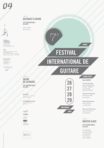
Image: pinterest.com
Hierarchy
Try using a visual hierarchy so that the most important elements are seen first. The most common way of doing this is by laying out your text in size order, starting with the headline as the most prominent feature before moving down to the subtitle, body copy and then the fine print. This ‘rule of three’ technique is used commonly by professional designers.
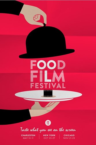
Image: behance.com
Flow
As the eye reads from left to right, it’s useful to position your information so that it flows in the same natural manner. Start with your headline in the top left, place the body copy just off center (at a slightly lower spot) and add your call to action in the bottom right hand corner for fast, digestible viewing!
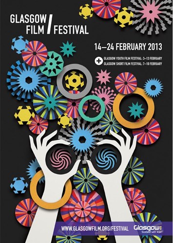
Image: lesleybarnes.co.uk
Balance
A standard rule of design is to have a good balance of text and images across the span of your poster. This adds stability and structure to your design and makes sure your key messages are more delivered clearly.

Image: jfletcherdesign.com
Symmetry
Symmetry can help people pay closer attention to the message in front of them. It helps to pull the eye towards the most essential focal points, while bringing about an overall feel of calm, trust and unity.
Image: pinterest.com
2. Colour
Next up is colour, which plays a huge part in poster design as it appeals to our visual senses and grabs attention. It can also be used to arouse certain emotions which compel people to take action.
According to the study Impact of Color in Marketing, researchers found that up to 90% of product-buying decisions can be based on colour alone. So it’s fair to say it’s pretty important, especially if you’re selling something!
Want to appeal to your audiences by simply picking the right colours for your design? Here’s what they suggest:
- Red is known to encourage appetite, so it’s often used by food chains. It also creates a sense of urgency, which is why it’s perfect for promoting a clearance sale.
- Blue is associated with peace, calm and tranquility. It provides a sense of security and can help to increase a person’s trust in a brand, which is why a lot of corporate brands and bank branches use it.
- Green is a great colour to use if you’re promoting environmental causes, healthy products or sporting events. This is because it’s regularly associated with health, relaxation and nature.
- Warm colours such as yellows and oranges have been proven to increase cheerfulness and optimism, which is why they’re often used in window displays to encourage impulse buyers.
- As for purples and pinks, they’re frequently used in the beauty industry and are linked to creativity, value and energy.
Additional research around colour has found that our brains prefer brands that are recognizable. Most big brands use colour to establish their identity (think Coca-Cola red, Tiffany blue and Starbucks green). If you plan on utilising colour in the same way, incorporate your brand colours into your design. This helps your audience to recognise you instantly so that they act on a feeling of familiarity and trust.
3. Typography
When it comes to the text on your poster, a carefully chosen typeface can really bring it to life. The typeface you use should convey meaning as well as work to draw attention when your poster is read from a distance.
In most cases, typography will be used to pass on vital information, so it’s important that the font you use is clear and engaging.
You can do a lot with typography. As well as being used as a way to divulge your details, it can also be incorporated into your graphics, much like the incredible examples below…
We love how this powerful poster uses typography to convey its message. The headline becomes lighter until it finally fades away to symbolize the effect that Alzheimer’s disease has on the mind of a sufferer.
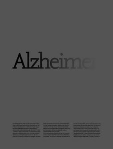
Image: pinterest.com
This typography is both inventive and playful. It would definitely grab your attention if you passed it on the street.
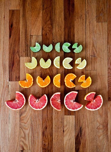
Image: inspirationde.com
4. Imagery
Posters are an extremely visual medium. According to studies, the most effective way to reach your audience is by using visuals that tap into their emotions to make them feel something.
A good method of doing this is to use faces on your poster. People are instinctively drawn to faces. We tend to associate facial expression with a feeling. So by using a person smiling to promote a music festival or a person crying to raise awareness of a charitable cause, you can easily draw an emotional response from your viewer.
Stephen P Anderson’s Get Mental Notes helps graphic designers apply psychology such as this to the creative process. He explains:
‘To be a good designer in today’s society, you need to have an understanding of psychology, human behaviour and … the little quirks in the way people operate. Then you can use them to make it easier for people to engage with your products.’
Of course, you don’t have to use faces alone to create emotion. As the examples below show, you can express your message using all kinds of imagery, as long as it is in some way relatable.
Food and drink - a direct link to a person’s heart, right?! All of a sudden, we fancy a Coke with dinner - weird!
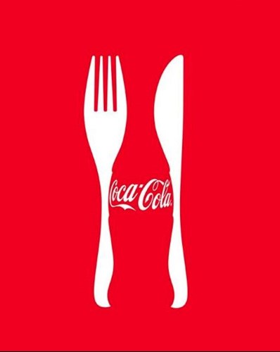
Image: pinterest.com
Brilliant use of humour to sell the message…
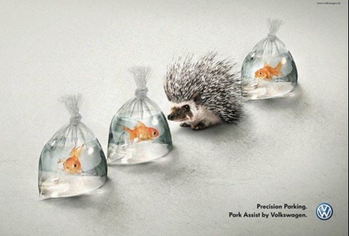
Image: designschoolcanva.com
This poster by Zoo Safari pulls you in using the face theory, but causes you to do a double take when you realise that all is not as it seems!
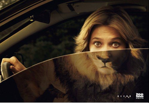
Image: designschoolcanva.com
So there you have it - a little food for thought on the chemistry of an effective poster! By using all or just one of these components, you’ll be more likely to engage your viewer with amazing posters.
Click here to create a poster using our free online poster maker. We’ve got loads of eye catching poster templates to help you create stunning designs. Make sure to share your beautiful posters with us on social media for a chance to be featured!