In this day and age, do you still send a postcard?! I mean, they always arrive when you’re already back from your holiday, and there’s such a small space for a message! In the modern world of immediate social media posts and Skype, some see them as such an antiquated form of communication and correspondence. The stats are somewhat damning, with perhaps most eye-catchingly, the fact that the U.S. Postal Service processed almost 500 million fewer postcards in 2014 than they did four years earlier. As a result, with our new range here at instantprint, we want to bring postcards back to life for Generation Z (people born after 1995 who grew up in the smart phone era), in an attempt to put them back in the mail, and restore physical post in this digital world.
Studies have shown that members of Generation Z have a significantly shorter attention span than millennials, and as a result, we have brought a more modern stripped back style to our art work. Our focus was less on bare breasted maidens in Benidorm and more on capturing a cross section of each location. The oldest known postcard was sent in the 19th century, and yet the style and approach has barely changed in the 176 years that have followed, and although we have modernised our designs, we have made sure not to stray too far from the classic format.
Following in the footsteps of our holiday destinations as a reality poster series, we have chosen the same fantastic five destinations, but on this occasion have focused on capturing the essence of each place in a minimalist, but substantial style, almost a rebrand, if you like. So, close your eyes and imagine the embodiment of a place, now, how would you consider that image on the front of a present-day postcard? Well, consider our designs, and let us know if we’re on the same wavelength.
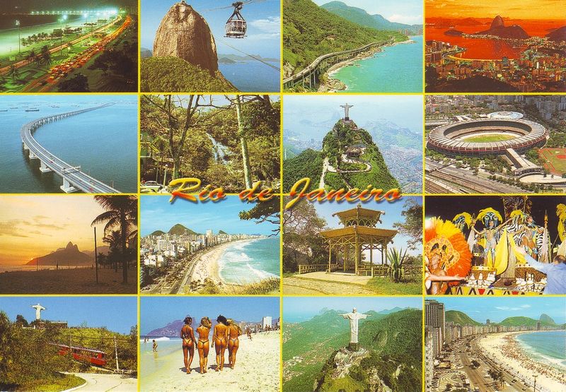
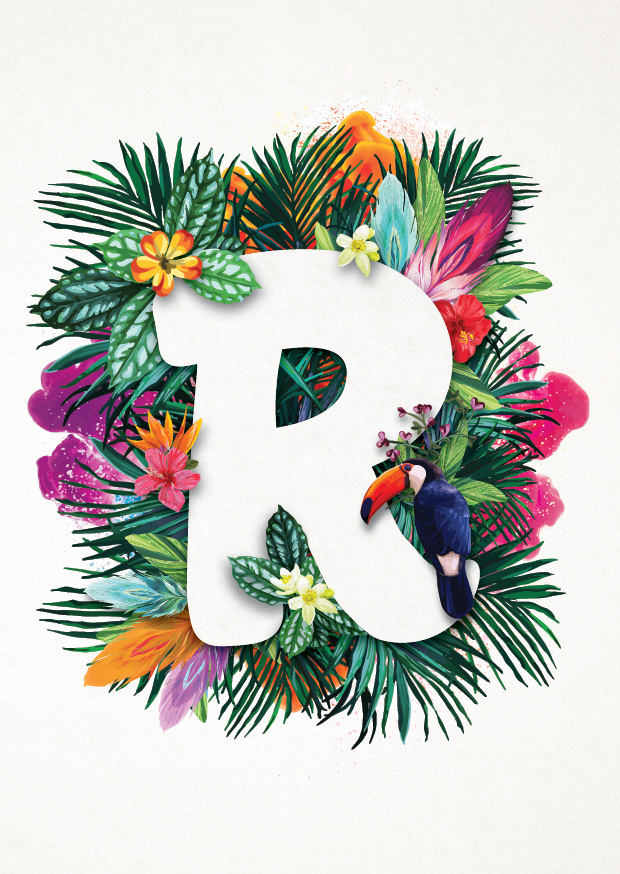
Rio de Janeiro
With its reputation firmly established as the samba city, and its fantastically famous beaches, Rio’s postcard past revolved around scantily-clad carnival dancers or beach-goers soaking up the sun; archived shots of Christ the Redeemer or even a nod to the country’s footballing prowess.
Our design has instead focused upon the vibrancy of the city and the fact that it is home to one of the world’s largest urban forests, capturing a tropical tonic. Our design oozes with the colour of carnival, exploding into a sea of floral foliage that detracts from the image of favelas and violence that plagues large portions of the city. We feel that the toucan overlooking the scene is the perfect symbol of Rio. In folklore, this brightly coloured bird, with its large bill, indicates a strong desire to be seen and heard, definite traits of the city.
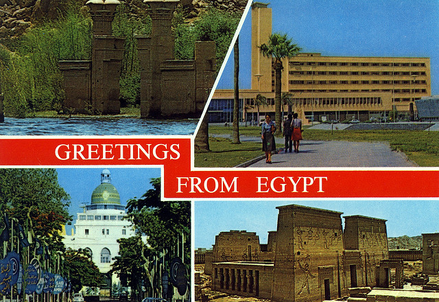
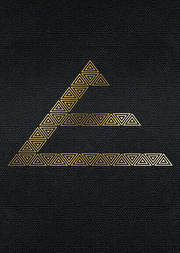
Egypt
A postcard from Egypt in the past has centred upon tired images of pharaohs, the River Nile, and in some instances, camels. These captured the essence of faded, historic Egypt, but didn’t really touch on its modernity and place in the present day. After a spell of difficulty and terror, which has affected the country’s image, Egypt is in dire need of a refresh.
We have built upon the classic Egyptian embodiment of The Pyramids, utilising the iconic outline to great effect, with a magnificent touch of modernity that truly grabs the attention. It’s The Pyramids but not as you know them!
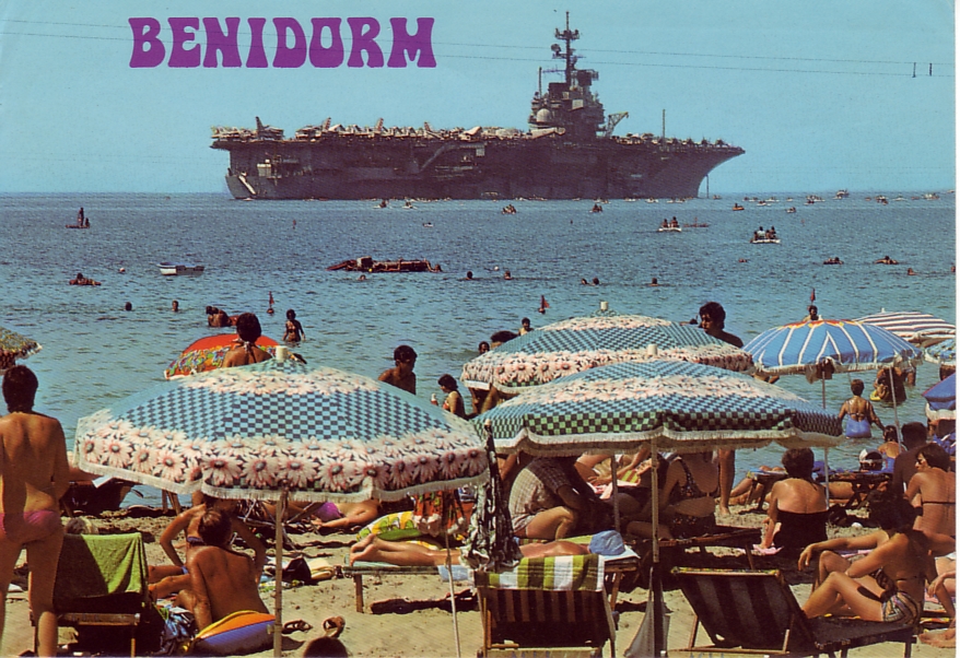
Benidorm
We’re all familiar with postcards from the Costa Brava, they’re of the high-rise dominated beach, littered with parasols and sun worshippers, or centred around a bikini-clad Benidorm babe. This collection of images is one that dominates the widespread perception of Benidorm, and as a result, our design needed to in some way pay homage to that.
Meanwhile, we decided that it was inconceivable to create content for Benidorm without a slither of British culture trickling through! The end result captures the luminous nature of the town, married with the exotic essence of Spanish culture, with its neon pink impossible to miss.

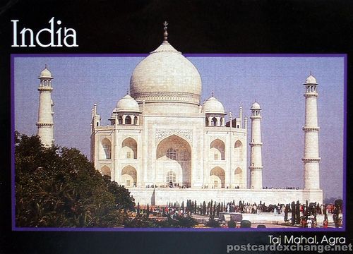
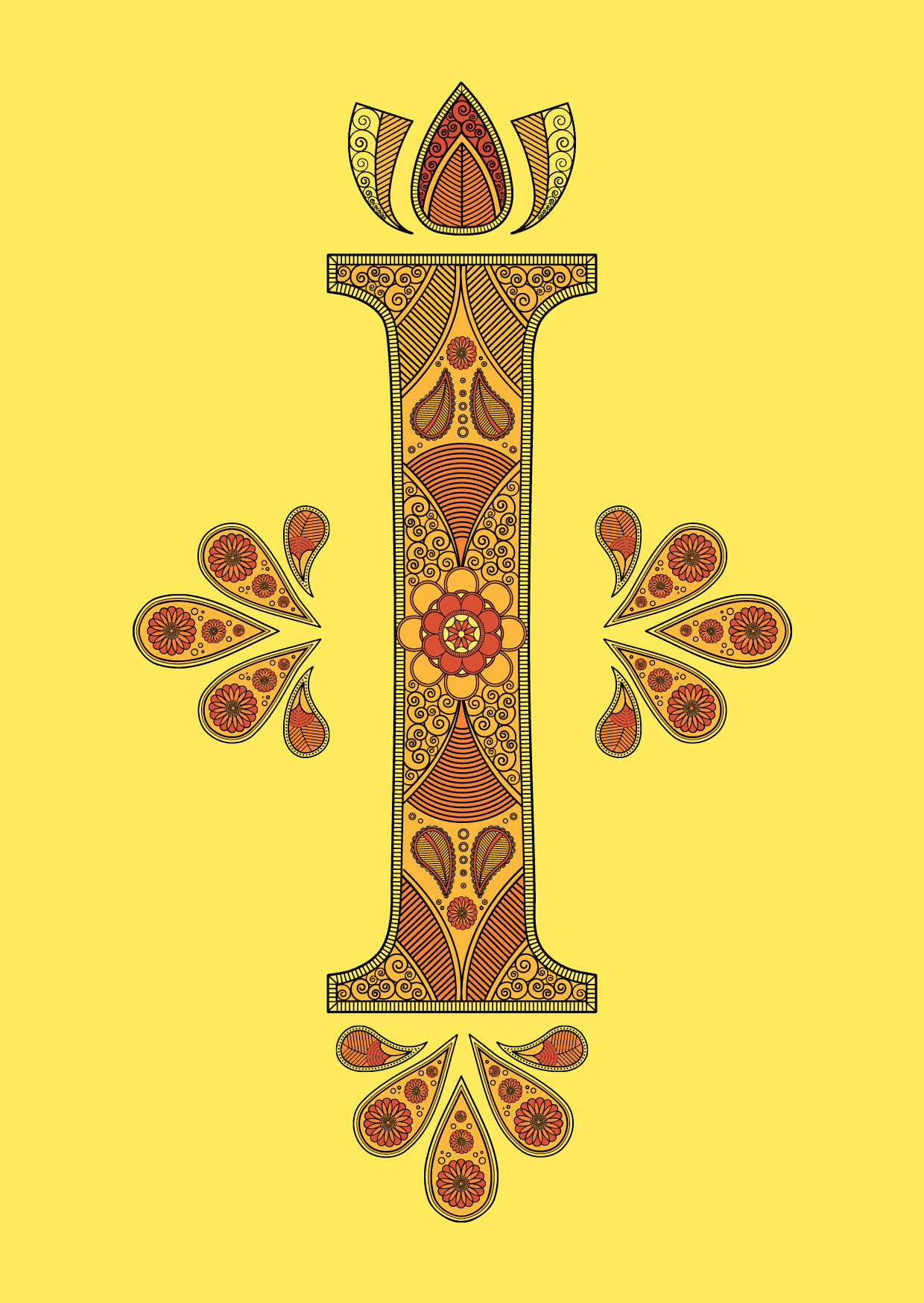
India
When looking for postcards for India, it’s hard to imagine not seeing one that holds the Taj Mahal at its core. This magnificent mausoleum is, however, just one mighty monument in a country that has an area of 3.287 million square km. The country celebrates a melting pot of cultures, religions and such diverse landscapes and terrains.
As a result, our focus has been focused less on India’s physical sights and more on utilising one of the most iconic designs in modern artwork, the Mandala. Our intricately adorned I is one that looks to Buddhism for influence and it’s clean, calm detail evokes this state of mind, whilst enticing the eyes for a more concentrated look.
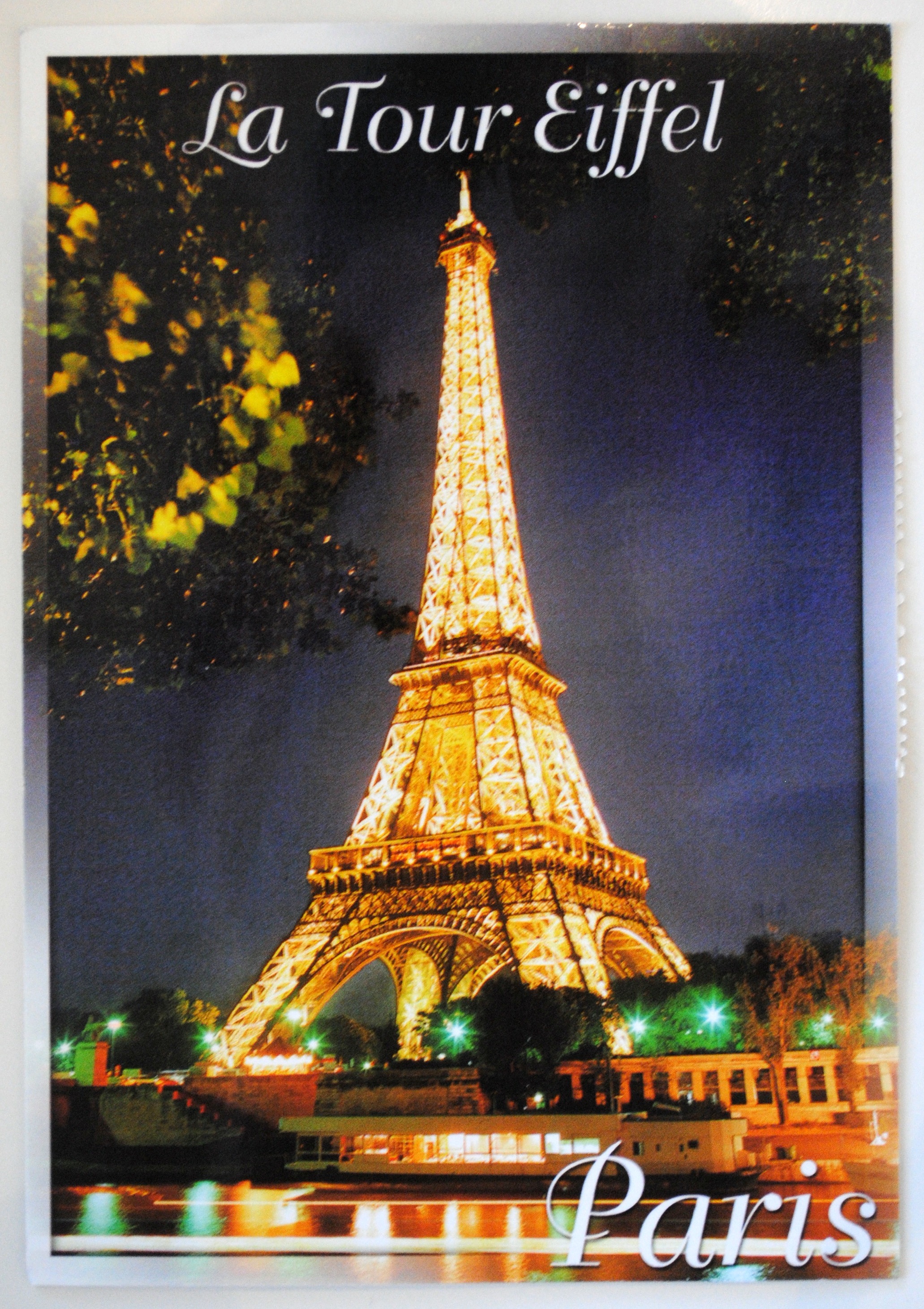
Paris
There’s a whole hoard of landmarks that can be used for Parisian postcards, but it’s always the Eiffel Tower that ends up dominating the image. Yes, this steely structure is the tallest structure in the city, but we feel it vital to finally take away the focus and to add a little touch of subtlety instead.
We have captured more of the baroque culture and heritage at the city’s heart. Art and history sit at the centre of Paris, alongside fashion, and our P is the embodiment of this, with this style of lettering originating in the 16th century. Our colour scheme adds a modern brilliant boost to such a classic style, while embodying the heart of France, the Tricolour. The city might be one of the world’s trendiest cities, but we certainly haven’t forgotten its roots.

So, with our more pared off, eye-catching designs, have we managed to put postcards back on the agenda? Well, that’s up to you, and if you feel like the postcard has been reborn, and we’ve inspired you, have a go at creating your own postcards.