(1).png)
When you want to make a scene, a poster is a great way to shout out your message to the masses. From simple text-based posters to detailed designs built around photography, there’s plenty of ways to make an eye-catching poster when you don’t have much time to do so. Whether you want to create a hard-hitting marketing poster or something just for fun, here are six quick ways to make an eye-catching poster in no time.
- Choose your fonts
Sometimes a bit of text is all you need. By choosing one amazing font or a combination of two (or three if you’re feeling artistic) you can design some striking posters in a hurry.
A poster is the perfect medium to get experimental with typography; mix fonts, go bolder, wider and more colourful. Why not just use your tagline or company mantra?
There’s plenty of font-mixing tools and tips out there but a standard rule of thumb is to use one serif font and one sans-serif font and try not to choose ones that are too similar to each other. Don’t forget to make sure it’s readable from a distance!
We recommend keeping your call to action as the most readable font. That’s the copy telling your reader exactly what you want them to do, e.g., ‘check out our website’ or ‘sign up online’. Here’s a guide to typography so you always know which fonts will work best for your printed poster design.
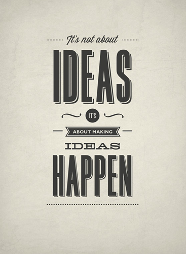
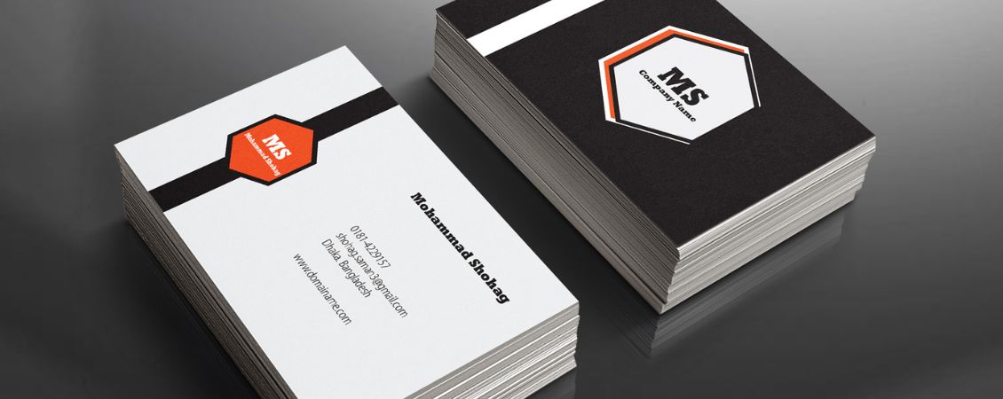
Image: etsy.com
- Work it three ways
Usually, posters are viewed from afar but, by applying the ‘rule of fives’, you can create an impact from all distances. Your design should work from 50 yards, five metres and five inches away. The main gist of your poster should be viewable from far away but, when you look closer, you should clearly see more details and a deeper overall meaning.
Consider the text hierarchy if you really want to attract your audience’s attention. Your design should have three different levels of text – level one is the most important (and biggest) text, level two directs their eyes to different sections of your design and level three is the main body of text. This makes your poster design more aesthetically pleasing and effective.
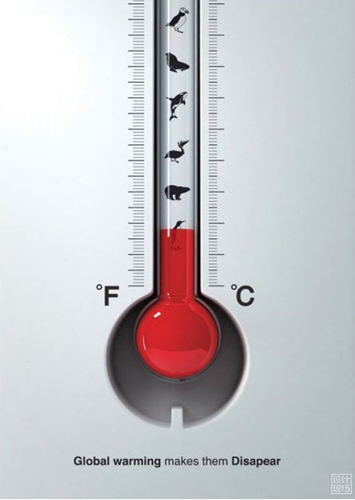
Image: weibo.com
- Tips for poster colours: Don’t be afraid of white space
One of our main tips for poster colours is that, sometimes, less really is more. After all, posters are viewed in a split second so there needs to be an element of simplicity with your design. White space, or negative space, is the area of your design that has no content – and it’s super-important for guiding your reader’s eyes around the poster. It shows them exactly what they should focus on and stops the design from being cluttered and off-putting.
We recommend choosing one word, one illustration or one photograph to be the centre of your poster design. Whatever it is, make sure it’s straight to the point and that your audience know what it is you’re promoting.

Image: gutewerbung.net
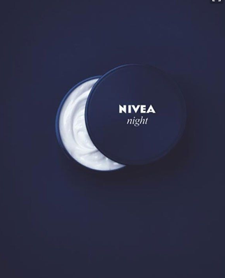
Image: theultralinx.com
- Link to social media
If you haven’t already heard, social media is big news. According to Ambassador, over half of people on social media engage with brands several times a month. This means that customers are beginning to expect businesses to have accounts on some of the big platforms like Facebook, Twitter and Instagram.
By using your social media as your call to action or featuring your tags and icons on your poster, you’re encouraging people to check out your account. As well as showing off your products and services, it’s also a great communication platform for customers to get in touch with your customer service team.
- Tips for poster colours: Pick a winning colour palette
Your colour scheme could be the making or breaking of your message. Different colours mean different things – for example, we associate red with sales. So, your colours will depend on both your event and your brand guideline.
For a successful sales or event poster, stick to two or three complementary colours from your brand. You’ll need a mixture of light and dark to make sure your message stands out from the design – think about what colour font will best stand out from your background for best results.
Here’s how to create a winning colour palette.
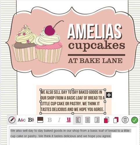
- Use a template
No graphic design experience? No problem, you can make an eye-catching poster with ease. Try our free poster maker where you can create your very own design based around an abundance of high-quality free templates.
Our in-house designer creates every design from scratch so you’re only a few clicks away from a slick, professional poster. Choose a poster template of which you like the look, customise the text, add your own images and away you go!
Or, if you want to add a personal touch to your print, you can design from scratch for free using the tool. Simply click on the blank template and get creative.
But most of all… just have fun!
The most unique and memorable posters are those which have a bit of fun or have a witty tagline. Come up with a sound idea to pin your design on and run with it. The objective is to make your poster memorable and, if you can get a laugh out of someone, the more likely they are to remember you.
We love seeing your finished designs. Share your print posters with us on Instagram or Twitter by tagging us @instantprintuk or #instantprintuk for a chance to be featured on our page.
Get in touch
If you need any advice on how to make an eye-catching poster, or perhaps you want some more tips for poster colours, get in touch. A member of our friendly team will be on hand to help with anything you may need throughout the design process.