
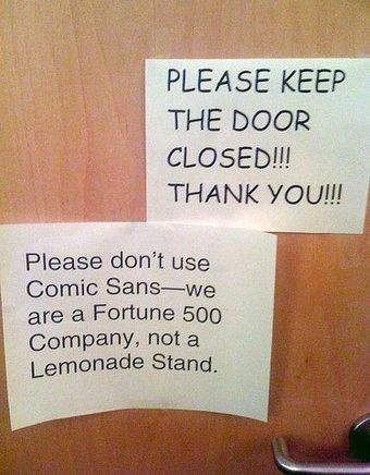
We’ve seen countless misplaced headlines in national newspapers, inconvenient blocking of magazine logos by images and don’t even get us started on Comic Sans – it really isn’t our type. Global visual culture is forever evolving and the need for crystal clear messaging through clean-cut fonts is stronger than ever.
We’ve taken-note from all the epic font fails you can imagine and whipped up some top tips to help you shy away from a type-related disaster.
1.) Readability Is Key
One of the most important things about selecting a font is readability. This is essential. If no one can read your font then it’s highly likely that people won’t believe in your business and services. Doing some market research and even a legibility font test may be useful in shaping your brand.
2.) Choose Typefaces with Adequate Spacing
Allowing sufficient space between letters makes your message much clearer. Some people get script font happy and don’t actually stop to consider how people will view the type. We’ve seen some serious birthday card font fails which have millions of views. It sounds crazy but if you’re ever in doubt, sometimes squinting at a font from a distance or new angle can help determine how others might view it.

3.) Avoid Overused Fonts
Your company logo is the identifier of your brand, so it’s arguably one of the most important features. You could describe this as the face of your brand which ultimately gives it its personality. Following font gimmicks, trends and fads won’t make your brand timeless. Keep it simple and relevant to your business. Helvetica is an extremely popular font which has almost diluted itself with its overuse. Imitating other brands logos definitely won’t make your brand stand out from the crowd; when choosing your font, try and make it as unique as possible.

4.) Consider All Your Marketing Materials
Every piece of marketing material you put out into the public domain represents your brand. We know its easy to make an accidental oversight with smaller marketing material but it’s essential you spend time checking over the finer details, to avoid any bad press or people forming negative connotations between that and your business.
5.) The Wrong Typeface
When choosing a font for your brand, it’s imperative it tallies up with your offering. A bad pairing can look silly, for example you wouldn’t use comic sans for a law firm. The look and feel of your chosen font is key and you should consider what you want people to think when they see your brand. We’d love to see more examples of font fails, so if you’ve found any be sure to share them with us.


.jpg)