(1).png)
Hello! I’m Leanne, and I’m the Head of instantprint’s Studio Team. I believe that anyone can create awesome, professional looking print – no matter their skill level.
How you design is up to you: you can choose to customise one of our free templates or create something from scratch with your preferred design software. Whatever your decision here are my top tips for designing print that really shows off how amazing your business is.
What Software Should I Use?
Not sure what design software to use? I’ve matched the main options with their appropriate skill levels to help you decide.
Advanced
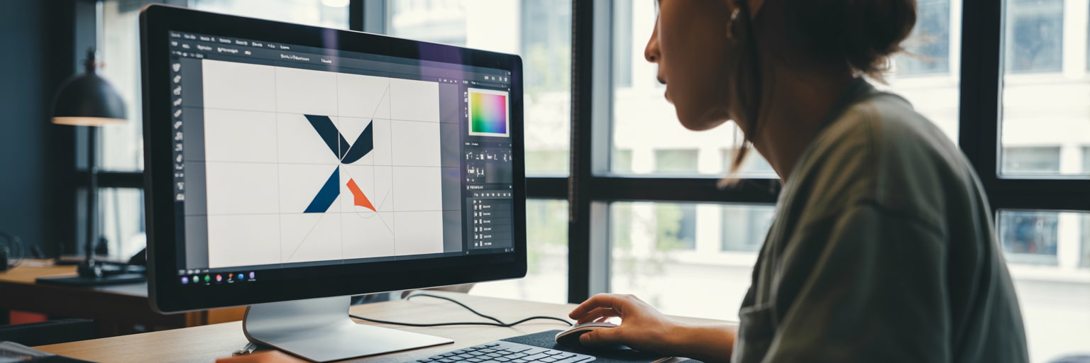
If you’re used to working with design software and you’re confident in using it then go for it! I’d recommend using Adobe Creative Suite for all types of artwork. This includes programs like Photoshop, Illustrator and InDesign.
You can always give it a try before you purchase the full package – you can download a free trial from their website and they have lots of tips and tutorials to help you nail it!
Intermediate
If you’re not familiar with Adobe Creative Suite, Microsoft Office is a fantastic design option for intermediate designers. It’s super easy to create simple text and image layouts on Word and Publisher.
Save your file as a PDF or JPEG and you’re good to go.
Beginner
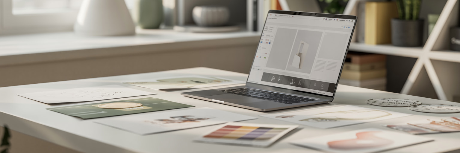
If you’re not as confident or just want something a little bit quicker, you can design on our website for free and still get a quality, professional result.
Pick a ready-made template or start from scratch. From there, you can add colour, shape, text and images to create a style that suits your business down to a T. You’ve got everything you need at your fingertips!
Before You Start
- Set your artwork up to the right size for your product before you begin
There’s nothing worse than designing your perfect business card to find it’s not the right size. Setting your document up to the right size at the beginning of the design process is the easiest way of making sure you get the size spot on.
Check out the product you’d like to design on the website, where you can find the exact size in the product specs/FAQs.
-
Remember the safe zone and bleed area
Imagine printing 500 flyers only to have your business’ web address cut off at the bottom of every single one. Trimming isn’t exact. That’s why it’s so important to keep all the important elements of your design 3mm away from the edges.
Adding 3mm bleed is also important for this reason. We’d recommend extending your design’s background colour or pattern as the bleed area. Check out our bleed guide for more advice.
-
Think about your layout
It’s always a good idea to use a grid or guide in design software to make sure the whole design looks balanced. This lets you align your text perfectly and give everyone element of the design its own space.
Our design online tool also has a grid option you can use to get your alignment spot on every time.
-
Research for inspiration
The internet can be a great tool for quick and easy research. Designing a flyer for a café? Search ‘café flyers’ using your chosen search engine to get results at the touch of a button.
When You're Designing
-
Use royalty free images
Make sure you’ve got the right to use the images in your design. A lot of websites will let you pay a license fee to download and use their images without paying additional royalties.
Make sure all images you use are high quality too – check out our resolution guide for best practice.
-
Design on a desktop computer or laptop
Design apps on your mobile phone and tablet aren’t usually able to product high resolution artwork for print. So even if it looks great on your screen, there’s a chance it’ll print blurry and even include the app’s logo somewhere on your design.
-
Avoid scans, screenshots and images from social media
Images on social media are reduced in quality to display online, and scans and screenshots are usually low resolution and might be aligned wrong. It’s best to use original images or high-quality stock images from websites such as Shutterstock.
-
Use CMYK colours
Computer and phone screens, like the one you’re using now, use RGB colours, meaning they show more colours than can actually be printed.
Commercial printing presses use CMYK (cyan, magenta, yellow and black). So, to get the best result, we recommend converting your designs to CMYK before you send them to us. Check out our colour guide for more help with this.
When You've Finished Designing
Only approve artwork online if you're happy with it!
Once you’ve finished and uploaded your artwork, we’ll send you a proof to show you how it’ll look when it’s printed. When you’ve approved this, it’ll go straight to the printer – meaning, we can’t change it.
We want you to have every confidence in your print job. That's why our Studio team will always manually check your artwork once you've placed your order. We’ll make sure everything set up properly for print, so you know the finished product will look amazing.
Top Tip
If you use our free design online tool, you can save your designs to your account – just remember to log in before you start designing.