(1) (1).png)
In light of the upcoming election, we decided to take a look at how UK campaign posters have changed over the decades. Election campaign posters are perhaps some of the most loaded marketing materials out there. Much like any advert, the posters are designed to persuade, however, the decision made by the viewer will go towards shaping society as we know it. With stakes this high, all aspects are exhaustively considered when designing and often the result is a highly emotive message.
1959
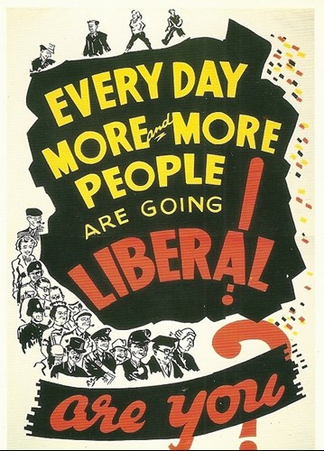
Poster for The Liberals 1959 (source: Irish Election Literature)
This poster came from The Liberals in 1959. The illustrated poster features the bold caption ‘Every day more and more people are going liberal! Are you?’ along with a crowd of people in black and white. This is an interesting way to approach the campaign as it plays on people’s innate desire to be part of a group. The colours used are mostly black and white but with yellow and red lettering – notably different to strictly yellow colour schemes of the more recent Liberal Democrat campaigns.
(source: The Guardian)
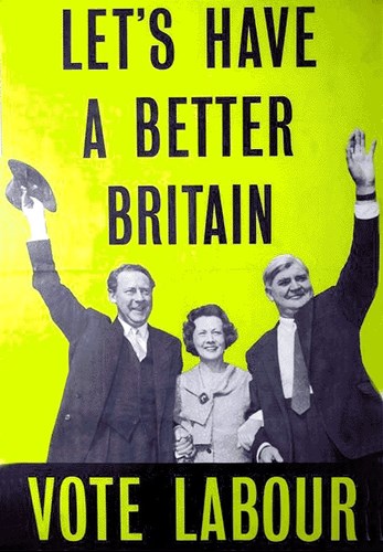
This was Labour’s campaign poster for the 1959 election. The bright yellow poster features Hugh Gaitskell, Barbara Castle and Nye Bevan sandwiched by the words ‘Let’s have a better Britain’ and ‘Vote Labour‘. This again seems like a nice and simple message and the colour yellow may have been used to represent a sunny future for Britain – Labour had not yet moved on to their signature colour of red.
(Source: The Mirror)
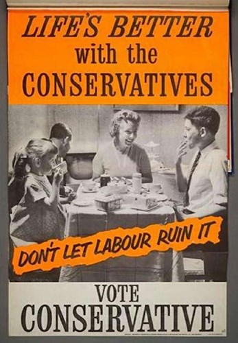
The Conservatives came back with this response to Labour’s message. The poster features a black and white photograph of a family eating dinner around the table with the words ‘Life’s better with the Conservatives. Don’t let Labour ruin it. Vote Conservative’ printed across a yellow banner. This play on Labour’s ‘Let’s have a better Britain’ may have struck a chord with the audience as the Conservatives went on to win the election.
Overall in 1959, we can see a trend towards black and white photography, large bold lettering and the colour yellow. It is interesting to see that yellow has been used across all three campaigns here – a colour often associated with optimism and hope.
1978
(source: Campaign Live)
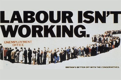
Labour’s poster from 1978 shows a long queue of people outside an unemployment office with the words ‘Labour isn’t Working’ in large bold letters above. The words ‘Britain’s better off with the Conservatives’ are printed below in smaller letters. This was later parodied in 2005 by Labour themselves, with the words ‘The doctor can’t see you know’. This was sparked by the news that 600 fewer GP surgeries would be opening over evenings and weekends under a Tory government.
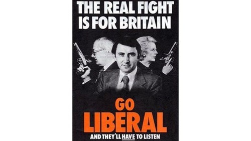
(source: BBC)
In this poster, The Liberals aim to set themselves apart from the competition and come across as an underdog. The poster features a black and white photograph of Margaret Thatcher and James Callaghan back to back holding guns, along with an unarmed David Steel facing forward with a calm expression. The words ‘The real fight is for Britain, go Liberal and they’ll have to listen’ are printed in bold orange and white. This is effective as it almost makes fun of Labour and Conservative’s rivalry and says, ‘We care about what’s important’.
In 1978, we see a move away from bright colours, with The Liberals only using a colour to highlight their ‘Go Liberal’ message. The campaigns start to include colour photography as it becomes more popular in UK culture.
1992
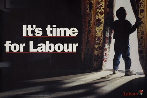
(source: BBC)
This highly emotive poster from Labour in 1992 shows a colour photograph of a small child stood in what looks like a typical family home. The child holds the curtains open and stares out – perhaps a metaphor for looking towards his future. Teamed with the simple words ‘It’s time for labour’, this poster pulls on the heartstrings of the viewer and leaves them thinking about their own family. What we now recognise as Labour’s red logo is subtly placed in the bottom right corner.
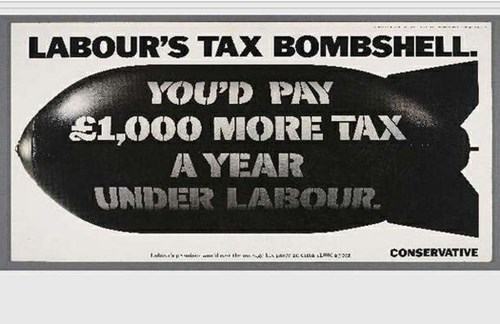
(source: The Mirror)
Conservatives continue their trend of targeting labour in this 1992 election campaign poster. The black and white poster is designed with the words ‘Labour’s Tax Bombshell: You’d Pay £1000 More Tax a Year Under Labour’. This counteracts Labour’s family based message and makes the viewer question their original trust for the Tory’s competition.
Again, colours are only used sparingly here. The colour photography used in Labour’s campaign is unsaturated to fit with the mood, with only hints of their signature colour red being used throughout. Conservative opt for a purely black and white poster and a stock image of a bombshell to make their hard-hitting point.
2001
(source: The Guardian)
This Labour poster from 2001 shows Tory leader William Hague wearing Margaret Thatcher’s hairdo. This poster, designed by Trevor Beattie, uses a sense of humour to mock their competitor with a manipulated colour photograph.
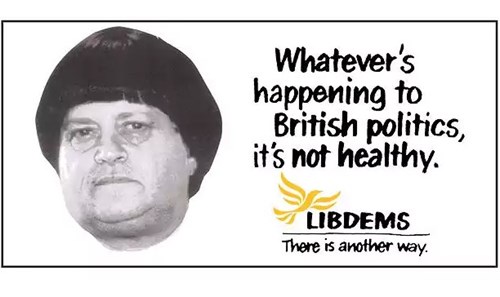
(source: The Telegraph)
Liberal Democrats poster from 2001 features John Prescott wearing Ann Widdecombe's hairstyle with the caption ‘Whatever’s happening to British politics, it’s not healthy’. This copycat of Labour’s poster uses a manipulated black and white photograph, again against a white background. Both parties have now settled into what we recognise at their signature colours and logos.
2010
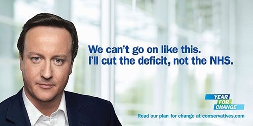
(source: The Guardian)
Above is the famously parodied Conservative election poster from 2010. The poster shows an airbrushed David Cameron with a stern expression next to the words ‘We can’t go on like this. I’ll cut the deficit, not the NHS’. The aim of the poster was to convey a compelling and heart-felt message from Cameron himself. However, this back-fired hugely as people around the country photoshopped it to comic effect. This is the first time that photo-manipulation software has been available to the masses and used to deface election posters to this extent. The conservatives use their now signature colour blue here – both in the background and on Cameron’s suit jacket.
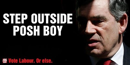
This openly aggressive poster from Labour features Gordon Brown looking rather less Photoshopped along with the words ‘Step outside posh boy’ in large capital letters. This is a much stronger message than the ‘Let’s Have a Better Britain’ caption used back in 1959. Note that Labour have now settled into their signature colour red, which can be seen on Brown’s tie and in the ‘Vote Labour’ text in the bottom left.
2017
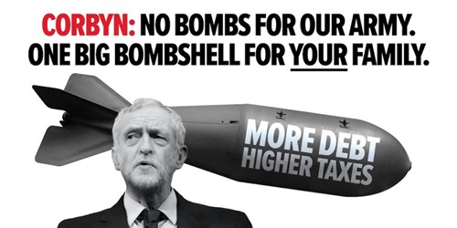
(source: Political Advertising)
The Conservatives have gone back to an old-fashioned style of design in their recent 2017 campaign poster – this time focusing on Jeremy Corbyn. The poster features two black and white stock images along with the words ‘Corbyn: No bombs for our army. One big bombshell for your family.’ It is also interesting to see that they have not used their signature colour in this image and have instead used Labour’s colour to highlight the name ‘Corbyn’.
It’s clear to see that over the decades, election campaign posters have become more and more cut-throat in their approach. The liberal use of bright colours in 1959 has now been tamed and designers are starting to use colour in a much more tactical way. Each party has its own colour branding and logo which is instantly recognisable to the public. We have also seen a rise in photomanipulation being used in these posters – a technology that was not previously available.
We are excited to see the response to The Conservative’s most recent campaign poster. Do you remember any great campaign posters from over the years? Let us know on Facebook or Twitter!
.jpg)