(1) (1).png)
How The Retreat Scotland have used colour and design to build relationships with their customers.
The Retreat Health & Beauty owns and operates three high class beauty salons as well as a luxury spa, all located in West Lothian, Scotland. We provide our clients with premium quality beauty treatments, including facials, massages, body treatments and holistic therapy.
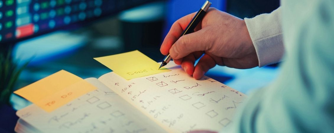
Not just a Poster or Leaflet
When people look at a poster, a website or a leaflet, most of the time they think it is something to see or read, a compilation of graphics that communicates news, information or offers. And this is absolutely true, but they don't realise that when looking at a piece of marketing a special bond between themselves and the brand has been created. This is the start or the continuation of a relationship and is a crucial part of any marketing strategy. Below we discuss how we, at The Retreat, use colour and design to build a strong relationship, with our clients.
Use of Colour
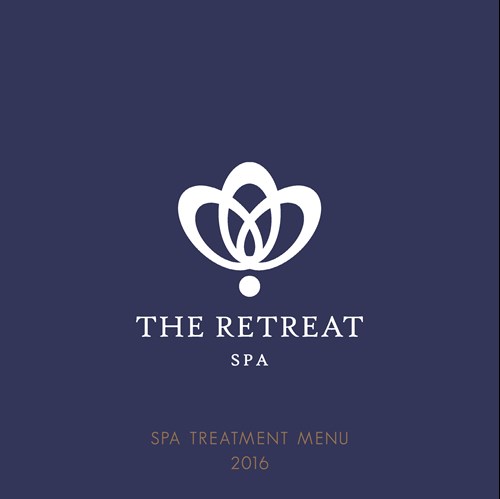
Being in the beauty sector, we feel lucky because we have the freedom to benefit from creative design. We use elements and a specific colour palette that aims to create a feeling of relaxation, beauty, luxury and tranquillity all at the same time. This was crystal clear in our minds since we created our logo and it became even clearer when we redesigned our website and posters. Like a lot of brands, colours are an essential part of our identity.
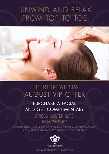
When we launched our new spa in Redmill last year we decided to go for a slightly different colour palette while creating an obvious relationship with our existing one. We did this to not only distinguish the spa from our salons, but also to highlight the premium service which we bring to the spa’s wellness experience.
We did this by using dark purple and bronze as the protagonists of The Retreat Spa compared to white and medium-to-light purple tones for The Retreat Health & Beauty Salons. Colours have their language, and we picked ours very carefully. Purple and its nuances are perfect to give a feeling of relaxation, calm and peace of mind; on the other hand, they express luxury,opulence and delight – especially when paired with elegant hues such as white, gold or bronze.
Brand Recall
Brand recall is really important for our brand. We offer a premium product & service so the purchase journey is quite considered compared to other products. When one of our clients sees a poster, an advert in the newspaper or a picture on Facebook, we want them to recognise it is The Retreat regardless of whether they see the logo.
We also want potential new clients to see our marketing and think that it's unique and most importantly that our offering is better than our competitors. Our goals are to build a relationship and establish a feeling that leads people to think we are more valuable and – in a way – more trustworthy than the other beauty salons and spas on the Scottish market. This isn’t easy, it's very ambitious and challenging especially in a sector where there are many other salons using similar brand colours.
Stocks and Sizes
Colours are the main way we deliver a specific feeling but there are many other factors we take into consideration when creating our marketing materials. One of the main things we consider is the type of paper. As mentioned above, we wanted to make clear that our salons and spa are part of the same family but at the same time they're different, like siblings. This was emphasised by the different types of paper we picked. The leaflets we use in the salons use standard leaflet paper (150gsm), mostly in A5 or A4 size, while for The Retreat Spa we created a square booklet with thicker paper (350gsm) and a gloss laminated cover. We felt this helped highlight the difference in experiences between the two areas of our business.
Layout and Fonts
As much as we can play with different colours of the same colour palette, there are specific elements that we want to keep as homogeneous as possible. We always use the same layout for any poster, price list or advert. We may change some visual elements such as the position of the header or even the background but always keep the logo and the website at the bottom.
Generally speaking we always try to be clean, elegant, and sometimes minimal, we partly achieve this with the fonts we use. We use a serif font in our logo, and usually when creating titles on our website or very simple graphics on social media, so that the people can recognise it right away. It's very elegant, so if we don't have much to say or we want to keep a formal tone, it fits in perfectly.
We also use a sans serif font called GeoSans Light and it's used pretty much everywhere. It's a very clear and clean font, so it's great for prices or for when we have a lot of text in the layout (e.g. our price list and treatment menus, or the spa booklet).
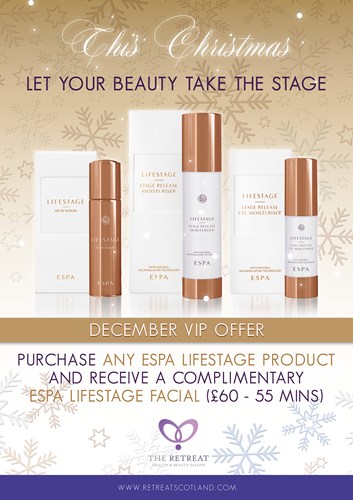
Finally, we use a handwritten font called Maratre which is quite scripty in style. We use it carefully, because as much as it is extremely refined, its readability is not the best. So we only use it for important headlines on occasions such as Christmas, Valentine's Day, Mother's Day or on our Gift Vouchers.
By following a standard layout and using the same fonts helps our clients identify the structure of our communications and makes them aware that it's us, The Retreat. We can say it's like playing the same song over and over, but in different styles: you will always be able to recognise it!
By adopting this approach the business has grown and we have been able to build strong relationships with our clients. This makes us confident that this is the right approach for us but as with any marketing brand there is always more work to do.