(1) (1).png)
Spot UV is a finishing technique used in commercial printing. It adds a high-shine gloss finish to selected areas, such as text or an image, to make it stand out against the rest of the document. It can also help create depth and texture, turning print into a multisensory experience. It’s used on products like business cards, flyers and presentation folders.
It can be hard to know how to use such a technique: too much and it overpowers the overall finish, too little and you barely notice it. We’ve scoured everything from Pinterest to Instagram, Google to Bing to provide you with fifteen of the best examples of Spot UV finishing that we’ve seen to help give you some inspiration for your next printing project!
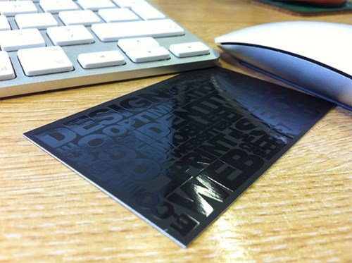
A monocolour business card doesn’t mean boring when it comes to Spot UV: this card shows how the high-gloss shine can really make words stand out, even if it’s black-on-black. We love how gloss looks on black; it’s one of the most effective colours to use it on!
This card makes the most of the advantage the texture Spot UV can provide. Many cards use Spot UV to highlight the logo, but by leaving it blank, this design helps the logo stand out from the raised background.
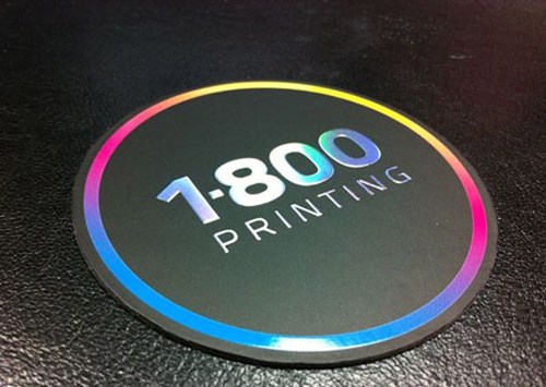
This round business card makes the most of Spot UV by highlighting only the colour on the image. This takes something already bright and makes it a vibrant, texture-driven experience.
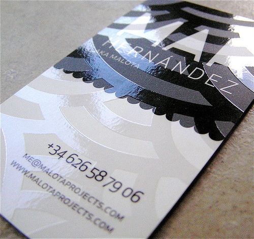
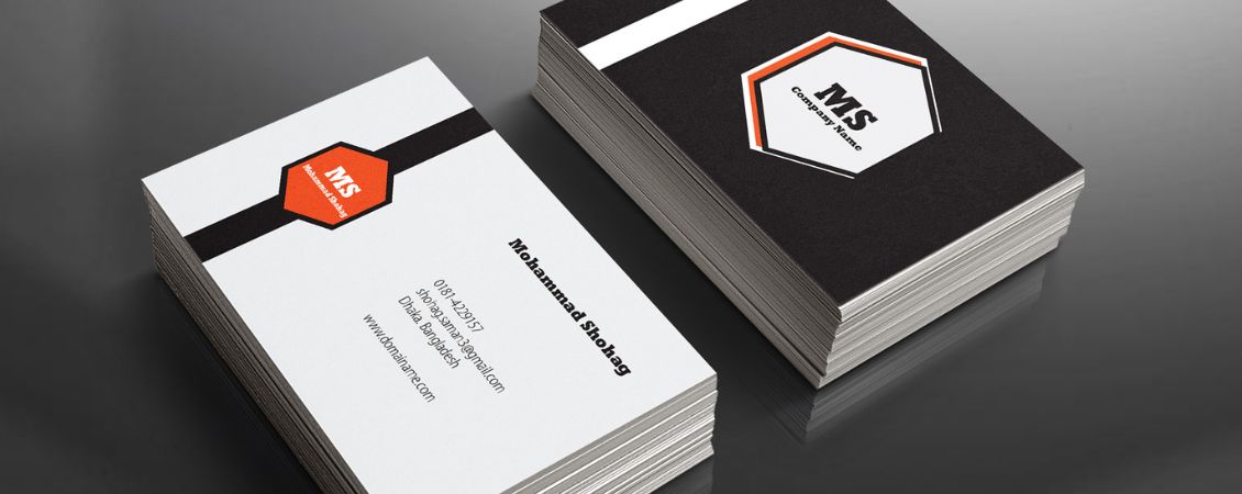
This business card has two interesting design aspects: first, it turns the classic landscape design and has switched it to be a portrait orientation. Simple, but effective in making people take notice. Of course, the second design technique here is the use of Spot UV to deliver an intricate background pattern, without overwhelming the messaging on the card.
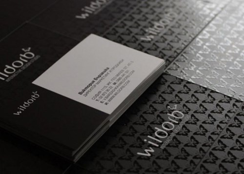
This Spot UV business card design really plays with the limits of monochrome. The Spot UV butterfly pattern creates an interesting feature to the eye and to the touch, while the black-on-white reverse side contrasts with the front of the card to make it truly memorable and easy to read.
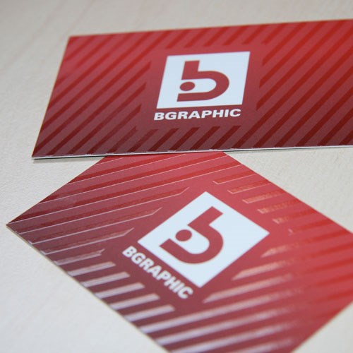
Spot UV is great to use almost as an additional colour to the standard colour palette: it gives an illusion of colour, without there actually being any! The texture is what creates the contrast and differentiation, and this is shown particularly well on monochrome business cards.
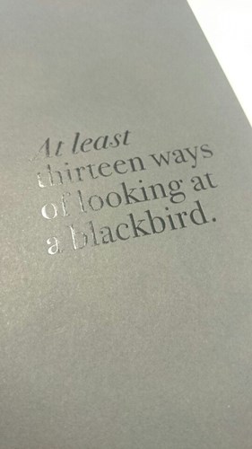
Okay, it’s not a business card exactly (we can’t actually tell what it is), but we had to include this simple-yet-stunning example of Spot UV. Highlighting text is always a great use of the finishing technique, and printing the high-gloss shine over a very slightly darker shade text (compared to the background colour) helps to make it really stand out, despite the subtlety. This style would look fantastic on a presentation folder cover.
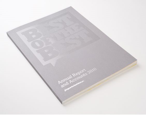
How about trying the absence of high-gloss Spot UV to draw attention to what you’re really trying to say? Here, the words are left matt, which makes them stand out against the high-shine finishing. This example of Spot UV also shows what you can do with larger projects, such as presentation folders or flyers.
Spot UV can add great texture and interest to any design. If you’re not sure how to create your artwork document so that it’s Spot UV ready, here’s exactly how!
Spot UV isn’t just for the graphic design pros. We’ve created loads of free templates you can use here – just upload them along with your artwork to the basket and we’ll do the rest.