 (1) (1).png)
Booklets can be a powerful marketing tool when showcasing your products and services. With plenty of printed pages to fill with eye-catching imagery and cool layouts there’s nothing more insightful to your product range than a well-designed custom booklet.
Finding a starting point can be tricky, you collate all of your imagery and you write your content, but choosing the right layout is really important to engage your readers.
We’ve put together our 5 favourite inspirational booklet designs to give you a kick start and get those ideas flowing.
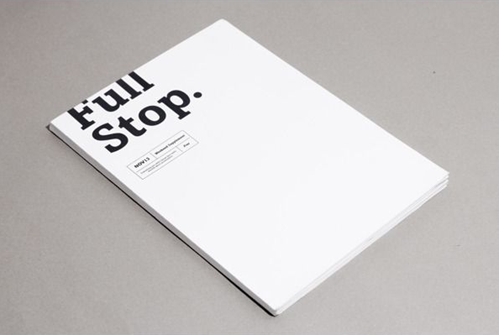
- White space
Never be afraid of white space, sometimes less really is more. With a bit of striking typography on a stark white background the result is definitely eye catching. It also helps guide the reader’s eyes exactly where you want them to go, which is essential for a booklet design. We love how the text is cut off the edge of the cover design on this one too!
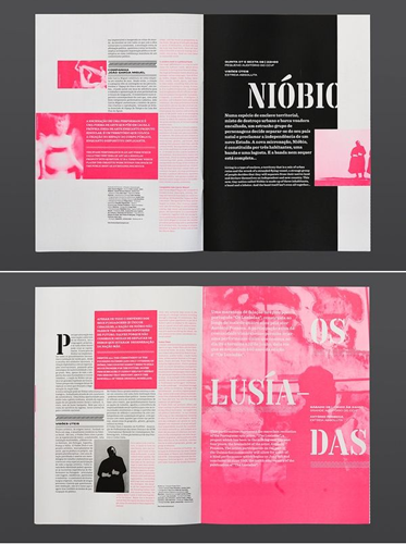
- Layers
By using just one prominent colour and layering the various sections you can achieve a sense of texture which makes the text much easier to read. This brochure template splits the text into bitesize chunks rather than having a solid page of heavy text! We particularly love the classic pink-grey colour combo that keeps a could-be busy design completely readable.
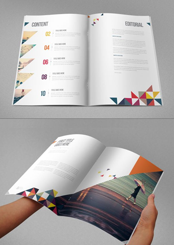
- Clear and colourful
This brochure design layout is very easy to read and the different sections are clearly defined and labelled. There is plenty of space for the text to breathe, especially if you are designing for an A4 booklet. Although it’s initially a plain layout, by using some colour or adding abstract shapes, the layout comes to life. What we particularly love about this design template is the sharp angles. So unique, they are ideal for creating interest without overwhelming the reader.
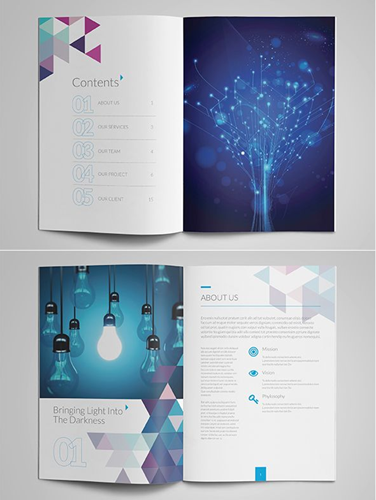
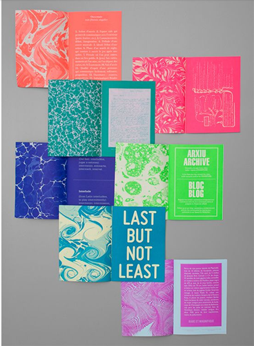
- Colour, colour and more colour
Using colour to define sections within your book can make for an eye catching read. We love bright and colourful design ideas like this! Why not try using block colours with white text to make a statement? That way your content will still be easy to digest even though you’ve got all those awesome colours.
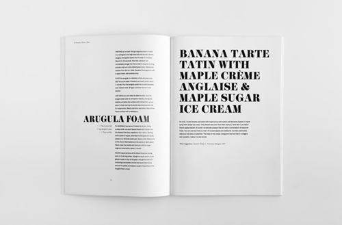
- Monochrome
Sometimes the simplicity of a black and white design is all you need. If you are working to a smaller size such as an A5 booklet why not play around with different font and text sizes for maximum impact. Booklet templates like this create a huge contrast to make an irresistible message.
- High Impact Imagery
One of the key considerations in graphic design is imagery – the pictures you want to use and how to use them. This high-end fashion magazine uses images as the main source of content – which is so important for a piece on art! To replicate this design, keep all text to a minimum and tell your story using high impact images.

- A Fine Spread
When designing your own booklet, it’s important to think in spreads rather than in pages. How will the pages look together when you open the book up? This booklet example not only keeps the double page spread in mind but uses it to its advantage fantastically with a numbered list in geometric shapes.

There’s a variety of different layouts and designs there to get those creative sparks started for your future booklet printing.
How do you start your booklet design?


.jpg)