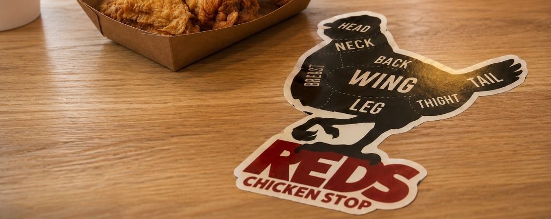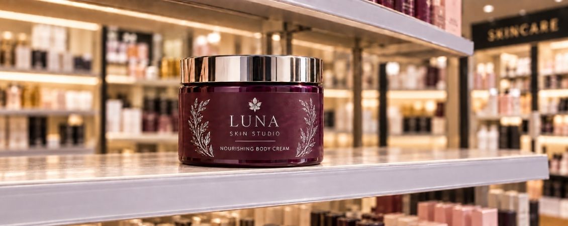
A shop shelf can be a noisy place.
Your product might be sitting between a competitor dressed head to toe in neon and another making some very enthusiastic claims in an enormous font. Even the loveliest packaging can struggle to get noticed when everything around it is asking for attention.
Creating shelf appeal doesn’t mean shouting louder, though. Often, it’s one considered detail that makes someone pause, pick up a product and take a closer look.
A foil sticker can be that detail.
Gold and silver foil catch the light in a way that standard printed colours can’t. As a customer walks past, that little flash of reflection gives your packaging a sense of movement. It might lead their eye towards your logo, bring out the product name or turn a plain box into something that feels far more special.
The trick is knowing what to make shiny and what to leave alone.
Table of Contents
What Gives a Product Shelf Appeal?
Should You Choose Gold or Silver Foil?
Where Should You Add Foil?
Creative Ways to Use Foil Stickers
How to Test Your Sticker Design
Give Your Products a Little Shelf Confidence
What Gives a Product Shelf Appeal?
Shelf appeal is partly about being noticed, but it’s also about being understood.
When someone looks at your product, they should be able to tell what it is, who made it and why it might be right for them. A beautiful label that hides the product name or leaves customers guessing about what’s inside isn’t doing its job.
Before deciding where to add foil, work out what someone needs to notice first.
For an established business, that could be the logo. For a newer food or drink brand, the product name or flavour might deserve more attention. A gift company may want to highlight that something is handmade, while a beauty business could focus on a hero ingredient.
Once you’ve chosen that priority, foil gives you a way to emphasise it without making the text bigger or squeezing another colour into the design.
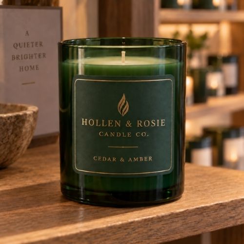
Imagine a row of candle jars with simple cream labels. Picking out each fragrance name in foil could help the products catch the light while keeping the overall look calm and coordinated. On a bottle of chilli sauce, one small foiled
flame might have more impact than covering the entire label in metallic details.
It’s less about how much foil you use and more about putting it somewhere that earns its place.
Should You Choose Gold or Silver Foil?
Gold and silver both bring shine to your packaging, but they don’t say quite the same thing.
Gold foil feels warm, confident and celebratory. It’s a natural choice for products designed to feel indulgent, special or gift-worthy. Think artisan chocolate, candles, jewellery, beauty products and limited editions.
Against deep green, burgundy or black, gold can feel rich and traditional. Put it alongside bright pink, turquoise or a bold illustration and it becomes playful, modern and much less formal. Gold foil could pick out sprinkles on a bakery sticker, a crown on a hot sauce label or a tiny bee on a jar of honey.
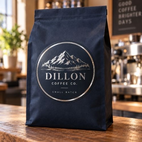
Silver foil has a cooler personality. It feels clean, fresh and contemporary, making it a strong partner for skincare, drinks, fitness products and technology brands.
It looks particularly sharp against dark colours, but it can also bring a crisp flash of detail to blue, white or brighter packaging. You could add silver lettering to a chilled drinks label, pick out stars on a children’s product or give an illustrated robot a properly metallic finish.
Neither option is automatically better. The right foil is the one that feels at home with your colours, product and personality.
If your packaging is warm, handmade and full of character, gold may fit naturally. If it’s minimal, precise and modern, silver might make more sense. Of course, there’s always room to play. A traditional product can feel refreshed by cool silver, while gold can bring warmth to an otherwise simple design.
Where Should You Add Foil?
When you’ve got something shiny to play with, it’s tempting to apply it everywhere.
The logo could be foiled. So could the border. And the product name. And that pattern in the background. Perhaps the ingredients deserve a little sparkle too?
This is usually the point where the foil stops helping.
If every element is competing for attention, customers won’t know where to look. Choosing one focal point gives the design more confidence and makes the metallic finish feel deliberate.
Start by deciding what job the foil needs to do.
A foiled logo can make your brand easier to recognise. A foiled product name can help one range stand apart from another. A small “limited edition” detail can give existing packaging a seasonal refresh without requiring a complete redesign.
Foil can also become part of an illustration. Gold honey drips, silver snowflakes or a metallic detail on a product character can make the finish feel woven into the idea rather than added at the end.
Whatever you choose, give it room. Foil stands out more clearly when it’s surrounded by clean space and strong contrast. A small gold logo against a dark background will often have more presence than a larger one fighting its way through busy patterns and several competing typefaces.
Readability matters too. Customers may first see your product from several feet away, so delicate lettering that looks gorgeous on a large screen can quickly disappear at actual sticker size. Keep the important words clear and let the foil support the message rather than becoming the message.
Creative Ways to Use Foil Stickers
Foil stickers aren’t limited to the main label on the front of a product. They can work across the whole packaging experience.
A circular gold sticker sealing tissue paper can make an online order feel like a gift. A silver logo on a plain mailing box adds a professional branded touch without committing to fully printed packaging.
Food and drink brands could use foil to help customers navigate different varieties. Keep the main layout consistent, then change the colour or foiled detail for each flavour. The products will look connected when they’re lined up together while each option remains easy to identify.
Smaller foil stickers are also handy for short-run messages. You could introduce a new recipe, seasonal flavour or anniversary edition without replacing your core packaging. Once the promotion ends, you can simply return to the original design.
Makers and independent retailers can use the same sticker across boxes, paper bags, jars and tissue-wrapped orders. That repeated detail helps different packaging formats feel like they all belong to the same brand.
Foil stickers can also work as quality seals. Place one across the opening of a box or bag to create a satisfying final touch. It makes the packaging feel finished and gives customers a small moment of anticipation before they reach the product inside.
For more ideas on formats, materials and finishes, explore our range of custom stickers and labels.
How to Test Your Sticker Design
A sticker can look perfectly balanced when it fills your laptop screen, then become difficult to read once it’s printed at its real size.
Before approving your design, print it out, attach it to the intended packaging and place it alongside a few similar products. A desk, kitchen cupboard or actual retail shelf will do nicely.
Step back and look at it as a customer would. Can you read the product name without leaning closer? Is it obvious what the product is? Does the foil draw your eye to the right place? Does the sticker still work when several products are placed side by side?
Remember to test curved packaging from different angles. A label wrapped around a jar or bottle can lose important details at the sides, so keep the main message within the area that faces forwards.
Lighting matters as well. Foil changes as it catches the light, which is exactly what makes it so effective. The rest of the design still needs to work when the metallic detail isn’t reflecting directly at the customer.
Finally, check that your artwork has been prepared correctly. Fine details, tiny lettering and important elements positioned too close to the edge can all cause problems. Make sure your design follows the bleed, safe area and resolution requirements for your chosen sticker.
Give Your Products a Little Shelf Confidence
Creating shelf appeal isn’t about making your packaging busier. It’s about giving the right customer a clear reason to notice it.
Custom foil stickers can turn a logo into a focal point, bring personality to an illustration or make simple packaging feel ready for something special. Gold can add warmth and confidence, while silver can create a cooler, cleaner finish.
Choose the detail that matters most, let the rest of the design support it and see how everything looks in the real world.
Your product doesn’t need to shout from the shelf. Sometimes, it just needs to catch the light.
.jpg)