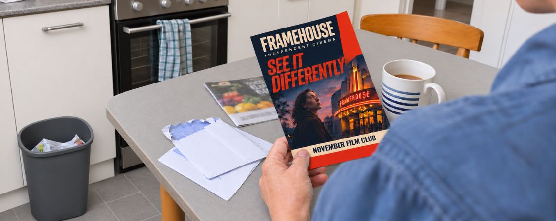
Let’s be honest: nobody creates a flyer hoping it’ll enjoy a brief flight from the letterbox to the recycling bin.
A good flyer should make someone pause. A great one should make them read, remember and respond. That doesn’t mean covering every available centimetre with enormous type, fluorescent colours and six different offers. Usually, the flyers that work hardest are the ones that know exactly what they’re trying to say.
From the first idea to the final handout, here’s how to create flyers people want to keep.
Give Your Flyer One Clear Job
Before opening your design software or writing a headline, decide what you want the flyer to achieve.
Are you trying to:
- Fill places at an event?
- Introduce a new business to the neighbourhood?
- Promote a seasonal menu?
- Encourage people to book an appointment?
- Drive visits to a shop, website or venue?
- Share genuinely useful information?
Pick one main objective. If your flyer tries to launch a service, advertise an event, explain your company history and promote four separate discounts, the reader won’t know where to look first.
A useful test is to complete this sentence:
After reading this flyer, I want people to…
If the answer takes more than one short sentence, your flyer may be trying to do too much.
Start With What Your Audience Cares About
Your business is important to you. To the person holding your flyer, however, the first question is likely to be: “What’s in this for me?”
Think about the situation your audience is in when they receive it. A busy commuter, a homeowner sorting through the post and a conference visitor carrying a bag full of handouts will all give your flyer a different amount of attention.
Instead of leading with a description of your business, lead with something relevant to their life.
Compare:
“We are an independent gardening company established in 2008.”
With:
“Get your garden ready for summer without giving up your weekend.”
The first tells readers about the business. The second gives them a reason to care.
This applies to every sector. A restaurant can lead with the dish people are craving. An accountant can lead with the worry they can remove. A tradesperson can focus on the result customers want to see. A charity can show the difference one small action could make.
Write a Headline That Earns Attention
Your headline has one job: persuade someone to read the next line.
Keep it short enough to understand at a glance and specific enough to mean something. Generic headlines such as “Quality You Can Trust” or “Welcome to Our Business” could belong to almost anyone.
A stronger headline might promise a benefit, answer a need or create curiosity:
- “Dinner sorted, even on your busiest nights”
- “Turn your spare room into a space you’ll actually use”
- “One Saturday. Twelve local makers. Plenty to discover.”
- “Is your boiler ready for winter?”
- “Free activities for little explorers this half term”
Clever wordplay can be brilliant when it supports the message. If the joke needs explaining, though, it has probably taken over. Clarity wins.
Make the Benefits Easy to Spot
Features describe what something has or does. Benefits explain why that matters.
Imagine a fitness studio promoting 45 minute classes. The class length is a feature. The benefit might be fitting an effective workout into a lunch break.
A café may use locally roasted coffee, but the customer benefit is a fresher cup with more flavour. A dog groomer might offer evening appointments, which means owners don’t have to rearrange the working day.
Look through your draft and ask “So what?” after every claim. The answer often reveals the more persuasive message.
You don’t need to squeeze in every benefit either. Choose the two or three most relevant to the audience and give them enough breathing room to land.
Design for Scanners, Not Scholars
People rarely begin at the top of a flyer and carefully study every word. They scan for a reason to pay attention.
Create a clear visual route through the page:
- Headline: What’s the main message?
- Supporting Detail: Why should the reader care?
- Key Information: What do they need to know?
- Call to Action: What should they do next?
- Contact Details: Where can they go?
Use size, weight and positioning to show what matters most. Your headline should look like a headline. Dates, prices and locations should be easy to find. Supporting copy should support rather than compete.
White space is useful too. It helps separate ideas, guides the eye and gives your design confidence. Empty space isn’t wasted space. It’s where the rest of the flyer gets room to work.
For more visual pointers, our guide to designing a flyer that stands out explores layout, branding and format in more detail.
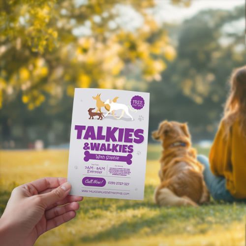
Give People a Reason to Keep It
A flyer doesn’t always need a discount to be valuable. Useful content can earn it a spot on a noticeboard, fridge or desk.
Depending on your business, that might be:
- A takeaway menu
- A list of important dates
- A local event programme
- A measurement or sizing guide
- A seasonal checklist
- A class timetable
- A recipe
- A small map
- A quick reference guide
A florist could include a guide to making cut flowers last longer. A garage could share a simple vehicle checklist for winter. An estate agent could add moving day reminders. A café could print its loyalty offer alongside opening times and a menu.
The question to ask is simple: what could you add that your audience might want tomorrow, not just today?
Choose Images With Personality
One strong image will usually make more impact than a collection of unrelated pictures.
Where possible, show the real business, product, place or people. A photograph of your actual food, venue or team can feel more distinctive and trustworthy than an image readers have seen elsewhere.
Whatever you choose, make sure it supports the message. A beautiful photograph that has little to do with the offer may catch the eye but leave the reader confused.
Image quality matters too. A picture that looks acceptable on a phone screen may become blurry when enlarged for print. Use high resolution images and avoid stretching small files beyond their limits. Check that you have permission to use the image and consent from identifiable people pictured.
Make the Next Step Obvious
Interest is useful. Action is better.
Tell readers exactly what you’d like them to do next. “Find out more” is vague, while “Scan to view this week’s menu” or “Book your free consultation by Friday” sets a clear expectation.
Your call to action could invite someone to:
- Visit your shop
- Book an appointment
- Scan a QR code
- Bring the flyer with them
- Register for an event
- Follow your social account
- Call for a quote
- Visit a dedicated web page
Keep the route simple. If you use a QR code, explain where it leads and give people a reason to scan it. Test it using several phones before printing and consider adding a short web address as a backup.
Check that essential details are present too. Dates should include the year when needed. Addresses should include enough information to find the location. Terms should be clear and contact details should be current.
Match the Format to the Moment
The right flyer format depends on how and where it’ll be used.
A compact flyer can be handy for counter displays, takeaway bags and face to face handouts. A larger format gives a bold visual or event programme more space. A folded design can help organise detailed information into manageable sections.
Think about what happens after someone receives it. Does it need to fit into a pocket? Sit beside a till? Survive in a bag? Be written on? Stay on a noticeboard for several weeks?
Paper choice contributes to the experience too. A sturdy stock can make a flyer feel worth keeping, while an uncoated surface may be useful if people need to write on it. A finish should support the purpose and personality of the design rather than being added for the sake of it.
Proof It Like a Customer
When you’ve spent hours looking at a design, your brain becomes very good at seeing what it expects to see.
Print a test copy at actual size and put it down for a while. Then review it as if you’ve never encountered the business before.
Ask:
- Can I understand the main message in a few seconds?
- Is the text comfortable to read?
- Can I find the date, price or location quickly?
- Is it clear what I should do next?
- Does anything feel crowded or confusing?
- Are the contact details correct?
- Does the QR code work?
- Have names, prices and dates been checked by someone else?
Read the copy aloud. Awkward sentences and repeated words have a habit of revealing themselves when spoken.
It’s also worth showing the flyer to someone outside the business. Ask them what they noticed first and what they think the flyer is asking them to do. If their answer surprises you, the design may need another pass.
Distribute With Purpose
Even the best flyer won’t work if it reaches the wrong people at the wrong time.
Start with your audience and work backwards. Where do they live, work, shop or spend time? When are they most likely to need what you offer?
A family attraction might distribute flyers through cafés, libraries and community venues before the school holidays. A business service could focus on networking events, shared workspaces and relevant trade gatherings. A new restaurant might target nearby homes, hotels and complementary local businesses.
Always ask permission before leaving flyers at another organisation. Better still, look for partnerships where both businesses can benefit. A wedding photographer and florist may share a similar audience. So might a gym and physiotherapist or a theatre and nearby restaurant.
Timing matters as much as location. A flyer for an event needs enough lead time for people to plan, but not so much that they forget. Seasonal services should arrive while the need is becoming relevant.
Test, Learn and Improve
Don’t leave the results to guesswork.
You could use a dedicated QR code, memorable offer code or specific landing page to see how people respond. If customers contact you directly, ask how they heard about the business.
Try changing one element at a time. Test two headlines while keeping the rest of the design consistent or compare distribution locations using different codes. That makes it easier to understand what influenced the result.
Pay attention to qualitative feedback too. Which questions do people ask after reading the flyer? Which details do they remember? Do they misunderstand anything? Every response can make the next version more useful.
The Fridge-Door Test
Before signing off your design, imagine it pinned to a crowded fridge door.
Would the headline still stand out? Could someone understand the offer without reading every word? Is there a useful reason to keep it? Can they see what to do next?
The flyers that escape the bin aren’t necessarily the loudest or the cleverest. They’re the ones that respect the reader’s time, offer something relevant and make the next step feel easy.
Give your flyer one job. Make every word and design choice help it do that job. Then put it somewhere the right people will actually see it.
.jpg)