 (1).png)
Companies evolve. They change their mission, product offering, or service scope. An organisation is a fluid thing: it’s OK to change the business plan year-on-year as your business evolves. The same goes for your branding.
A rebrand exercise is necessary if:
1) You’ve recently acquired or merged with another company;
2) Your product or service range has significantly changed;
3) You now work in more, or different, industry sectors;
4) Your grandma can remember the logo (exactly as it is now) from her childhood;
5) Your logo, colours, or strapline are too similar to a competitor (even if they started after you).
However, a rebrand is a tricky exercise to pull off well. If you stray too far from your previous branding, you risk losing customer awareness. If your messaging changes too much, it’ll confuse your existing customers. You’ll only really need a hardcore, all-out total change if there have been major shifts in your company, such as a merger or acquisition.
A brand update, to refresh your logos and ‘move with the times’, for example, might only mean a tiny tweak of a colour here, a curve on a corner there. A merger, however, could result in an entire renaming of your company – which involves a massive informational marketing campaign to let existing customers know you’re still doing your thing, as well as build awareness in your newer demographics to stand out from your competition.
Examples Of Great Rebranding
So: what IS a ‘good rebrand’? It’s one where the essence of your company vision and mission remains clear, without alienating existing customers or confusing potential prospects. Let’s take a look at some companies who have done this with style in recent years...
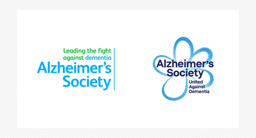
The Alzheimer’s Society
This is a great example of how to refresh an already well-established brand. The Alzheimer’s Society already had a very recognisable logo, with the green strapline concisely explaining the charity’s mission.
Trydesignlab.com
The new logo uses a similar blue palette, but has omitted the previously-striking green in the tagline. Where the old logo was very hard, harsh, and practical, the new one is shaped like a flower for a friendly feel, helped by the more modern combination of fading and rising colour which adds depth and warmth compared to the previously ‘flat’ logo.There is significance in the flower, too: it’s a forget-me-not, reflecting the mission of the charity in visual form.
The change in wording is also significant: switching “Leading the fight against dementia” to become “United Against Dementia” gives the charity a snappy slogan that removes the aggressive, challenging tone of the word ‘fight’ and instead uses the more accessible, inclusive ‘united’. It’s a subtle semantic shift but it gives the reader the impression that everyone supporting the charity is part of their mission, whereas ‘fight’ suggested that the charity was spearheading something that their fundraisers were only secondary to, and not a part of.
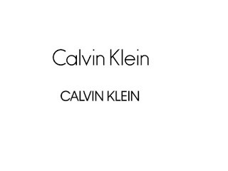
Calvin Klein
A great example of a practical rebrand, in February 2017 leading fashion brand Calvin Klein released a new logo.
Tarekchemaly.com
Initially, it looks similar to the previous one – but look closer. The all-capitals make it very easy to translate across a wide range of digital channels, something much harder to do well with the older, rounded logo.
The brand wanted to acknowledge the ‘founder and foundations of fashion’ by going back to a more retro design – a move that, in itself, has become a fashion in branding recently.
Virgin Festival 2017
The latest update to the V Festival logo means a significant shift away from Virgin’s iconic red. The old logo, in the classic red and white, has been replaced with a vibrant, multicoloured graphic with all-new typeface to boot.
![]()
Digitalartsonline.co.uk
The old logo had a dated, 1990s feel to it. While the logo has changed every year of the festival, the typeface has remained the same since 2012 when it went for a ‘retro British’ vibe. The ‘handwritten’ typeface, chunky lettering, and minimal graphics were no longer working to represent the brand.
Prolific sign writer and artist, Archie Proudfoot, was appointed to create a new typeface for the logo. He made up a series of letter options in Illustrator, each encapsulating the vibe of the fairground and circus, and each still using some of the classic Virgin red.
The brightly coloured graphic and brand new bespoke typeface have not only refreshed the logo, but also delivered the essence of the festival in one image: it looks like summer, the beach, the fairground, and of course sunshine (helped by the huge yellow circle making up the centre of the graphic).
It wasn’t just the logo that was overhauled: a series of graphics and illustrations were also compiled in the same brand colours, to reflect the ‘summertime fair’ feeling of the logo, which are used on everything from event signage to social media posts.
What To Consider For A Rebrand
If you’re thinking of taking the leap and rebranding your company, remember to take these things into consideration first:
1) How much change is needed?
2) What resources can you afford to dedicate to the rebrand? (A designer, a team, an external agency?)
3) How will you communicate the changes internally, to existing customers, and to new prospects?
4) What is the driving force behind the rebrand? (Merger, refresh, repositioning?)
5) How will the rebrand do what you want it to? (Show the merger, update the brand, reposition you in the market?)
6) Can the rebrand be recreated effectively in print AND in digital format?
When you’re ready to rebrand, have a think about the items you need to update. Everything, from branded notebooks to the colour you paint your office, might be affected! If you use branded pens, send out letters on marked letterheads, or have printed price lists, it’ll all need updating. A rebrand, therefore, can be a huge undertaking – but can help you to move your business forward and continue to evolve, survive, and thrive.


