(1).png)
Whether a booklet, leaflet, or folded business card, there are many reasons to use folds in your print media. For example, a folded business card will double the amount of promotional space available, giving you four sides instead of the traditional two. A folded leaflet is a great way to include more information about an event or product, without the need to size up the page (from A5 to A4, for example).
Whatever the product, folds can be used imaginatively to make the most of your design. There are, however, a few top tips to follow when designing folded artwork to make sure you get the best finished product possible…
1. Don’t Go Too Dark On the Fold
If you have a solid dark colour, such as black, placed over the fold crease, you risk this area cracking. Dark inks on a paper crease are prone to fading or cracking, which can spoil your overall look, especially for a folded product with a long life span. While darkers colours are fine on single-use and short-life print items, it’s best practice to use a lighter colour where possible.
2. Consider What Type of Binding or Fold You Are Using
A bound booklet will have different design needs to a basic single fold. Booklets are bound with staples or glue, while a simple fold is a crease in a single page.
A bound booklet requires additional space where the binding occurs in the centre, otherwise you risk losing part of your design between the pages. The picture below is a good example of what happens when you don’t allow for binding margins (known as gutters)!
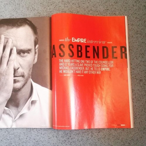
(This is an article about Michael FASSbender. We promise.)
However, if your product has a simple crease, such as a leaflet or a folded business card, your design can go over the fold without additional gutter space needed in that area. It’s still best to keep the design simple where it does cross a fold, as paper will crease and this could detract from your desired final outcome.
3. Choose Your Spot UV Areas with Care
Spot UV is a fantastic tool to give texture and depth to your product. It’s a high-gloss shine finish, that can be placed in any area you wish, to highlight certain areas of the document. For example, you might want your company logo to stand out on your presentation folder, and adding spot UV finishing to this area will do this to great effect.
Spot UV is a gloss lamination finish, which can make it fragile. If you’re using this as a finishing technique, be sure to keep it as central on the page as possible – and definitely more than 3mm away from any fold or cutting edge. If the spot UV goes into these areas, you risk losing the smart finish as it cracks or peels.
4. Keep Text Out of the Crease
As we’ve already discussed, that pesky creased area can be prone to cracking. That means, if you’re placing text across a creased area, cracking may make your message illegible. To stay on the safe side, make sure all text is at least 3mm away from the edge of your design, otherwise known as the ‘safety area’ in the printing world.
5. Incorporate Folds in with Your Design
So, we’ve covered the risks – so how about the fun stuff? Folds are fantastic for designers, because they allow so many different possibilities. Cross folds are great for maps, C folds feel like you’re revealing something exciting to your customers, and folded business cards make perfect note or appointment cards, making them marvelous multi-use items! Use this opportunity to elevate your print design and make the most of all that space.
Have you seen any great examples of design with folded print products? Share them with us on Facebook!