 (1) (1).png)
What makes a film poster successful? To us, it’s something that gives nothing away and yet somehow manages to get us excited. In the early years of cinema, movie posters were used as a main source of advertising. In the same way we use a menu in a restaurant, they had to catch the eye, tease the viewer and stimulate a need to see the film.
There are certain movie posters that have stood the test of time to become iconic. These posters are so familiar, so epic, that they’re forever burned into our consciousness.
To give you a taste of what we mean, here’s a round-up of 12 posters that we believe are as iconic as the films themselves…
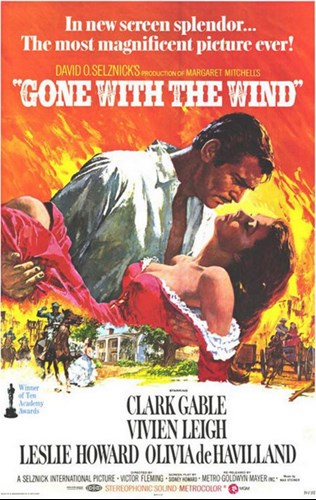
- Gone With The Wind (1939)
Gone With The Wind is one of the most iconic films of all time. The poster, which was designed by art director Tom Jung and painter Howard Terpning, manages to encompass a sense of passion, conflict and chaos which perfectly sums up the film. The famed romantic clinch between Rhett Butler (Clark Gable) and Scarlett O’Hara (Vivien Leigh) has inspired countless movie posters since, including 1980’s The Empire Strikes Back, where Han Solo (Harrison Ford) is holding Princess Leia (Carrie Fisher) in exactly the same pose. Cheeky!
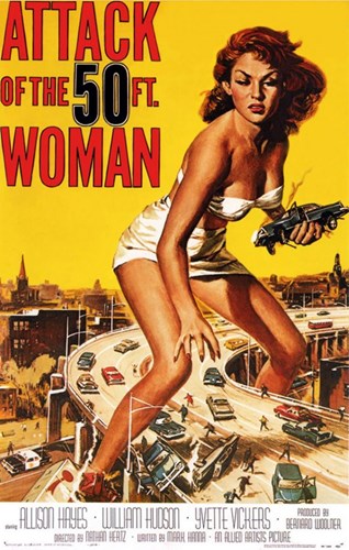
- Attack of the 50ft Woman (1958)
This B-movie horror is a cult classic springing from the drive-in era of 1950’s Hollywood. It’s fair to say that even if you haven’t seen the film, you’ll have come across this brilliantly lurid poster. Created by artist Reynold Brown (who also designed the posters for Ben-Hur and Creature from the Black Lagoon), it was a stark contrast to the majority of horror posters at the time, which regularly featured screaming women running away from monsters. In this case, the woman was the monster! Pretty tall one too.
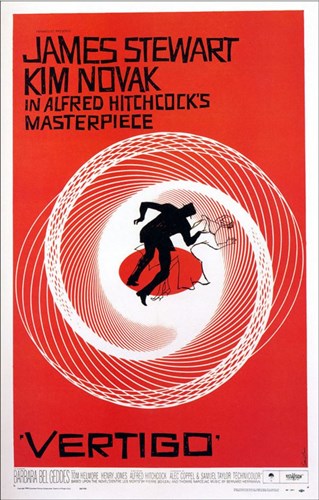
- Vertigo (1958)
Saul Bass was an incredible graphic designer. Not only did he create the poster for Hitchcock’s Vertigo, but he was the mastermind behind the haunting opening sequence too. His work on the Vertigo poster set the bar for his peers and it quickly became a landmark in graphic design. It’s easy to see why; everything on the poster works to evoke feeling. The use of red gives off a sense of alarm while the rugged, stiff text drums up tension. The real brilliance stems from the dizzying illustration, which drives home the spiralling premise of the film.
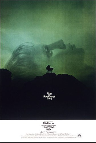
- Rosemary’s Baby (1968)
The story of Rosemary’s Baby revolves around the paranoia that lead character Rosemary (Mia Farrow) experiences after mysteriously falling pregnant. As a nod to the film’s powerful psychological themes, the poster uses clever symbolism, such as the baby’s pram being strategically placed smack-bang in the centre of Rosemary’s head. Well played Roman Polanski, we’re a sucker for genius symbolism!
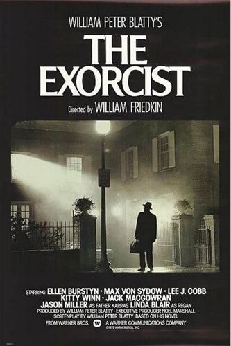
- The Exorcist (1973)
While we’re on the horror train, let’s talk about the poster for (the most terrifying film ever!) The Exorcist. Designer Bill Gold was told that he couldn’t use any images of Regan (Linda Blair), the girl who gets processed in the film. After trialling various ideas, each one being rejected by the studio, he shot a photo of the priest arriving for the exorcism, briefcase in hand and visibly cautious of whatever he was about to enter into. This image made the cut and rightly so; it’s a masterpiece of shadows and light, fear and the unexplained; a perfect representation of the themes within the film. It offers no explanation as to what’s going on (not even a tagline) and yet somehow it manages to stir up all kinds of creeps! *Shiver*
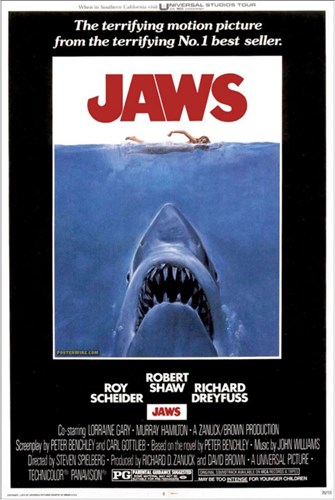
- Jaws (1975)
Don’t know about you, but after watching Jaws as a kid, we wouldn’t even get in the bath for fear of being eaten by a shark (because sharks can swim up plug holes, right?)! It was scary stuff and the poster alone is enough to bring on a plague of recurring nightmares! The man behind this poster was designer Tony Seiniger. He wanted to create something that no one had ever seen before, something unforgettable. "That's the challenge,’ Seiniger explained, ‘to try get two hours of entertainment down into a simple graphic that you can read in three seconds.” He certainly achieved that; from the infamous typography, complete with a fish-hook shaped ‘J’, to the use of the word ‘terrifying’ not once, but TWICE! Just in case you didn’t get that from the massive shark looming in the depths, poised like a missile ready to strike. Seriously, how has that poor girl not noticed him yet? Is she aware she’s about to meet her maker? Look at the size of that thing!
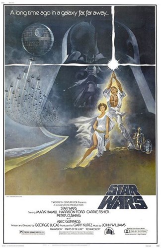
- Star Wars: Episode IV A New Hope (1977)
This poster was our very first glimpse into George Lucas’s revolutionary universe. Created by Tom Jung, it features Princess Leia (Carrie Fisher) and Luke Skywalker (Mark Hamill) looking, well, buff. Princess Leia is all legs and Luke is all abs… made only slightly awkward by the fact that they’re brother and sister. Anyway… this may have been in reference to Frank Frazetta, an artist known for his muscle-bound book covers and the man who 20th Century Fox had originally wanted to design the Star Wars poster. Instead they hired Jung and we’re thankful they did. His poster stirs the imagination in so many ways. The now uber-famous tagline (‘a long time ago in a galaxy far, far away’) paired with Darth Vader’s helmet-clad face looming threateningly over his (spoiler alert!) children is intriguing, exciting, inspiring… basically everything you want a movie poster to be.
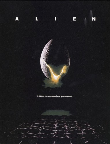
- Alien (1979)
What IS this? Says anyone seeing the Alien poster for the very first time. If you haven’t seen the film, you’ll probably have a lot of questions. Is that an egg? Why is it oozing light? Is the egg-thing floating over a movie theatre (no?)? What’s cracking (ha-ha)? This particular poster does a great job of evoking both dread and curiosity, especially with the ominous tagline ‘In space no one can hear you scream’. So atmospheric. SO good!
- Indiana Jones – Raiders of the Lost Ark (1981)
The second Harrison Ford flick to make the list. Raiders of the Lost Ark is an all-action, rumbustious romp of a movie and the poster reflects this perfectly. Designer Richard Amsel created a comic-book style visual, complete with whips, hats, swords, snakes and some sort of golden alter. If there’s one thing that’s clear from this poster, it’s that you’re in for an epic adventure, and as Amsel once said: ‘If I paint or draw something that takes people into the realm of fantasy, then I feel that I’ve accomplished something.’ It’s fair to say he nailed it with this one!

-
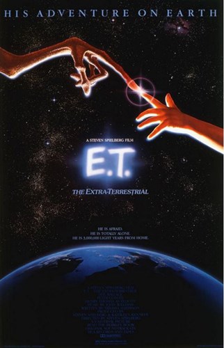
- E.T (1982)
That’s right, another alien, only this time it’s not so scary. Spielberg’s E.T is a gold nugget of a film, forever memorable and a total sob-fest (don’t try and tell us you didn’t cry at E.T!)! The poster gives us the feels for so many reasons. Based on Michelangelo’s The Creation of Adam (as suggested by Spielberg himself), it illustrates the connection between alien and human. Or in this case, the friendship between Elliot (Henry Thomas) and E.T, through which Elliot seeks salvation from a wise, celestial E.T. Deep.
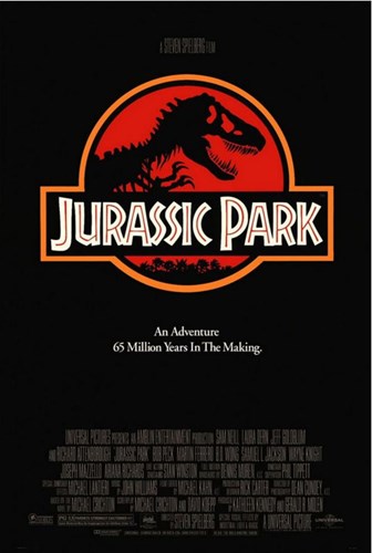
11. Jurassic Park (1993)
We don’t need to tell you how awesome Jurassic Park is, you know. But we will tell you how awesome the poster is. The fact that they use the very same branding to promote the film as they do to promote the park in the film is a stroke of absolute GENIUS! And the logo, oh the logo! Bone-like typography, the use of red to warn of danger, the silhouetted t-rex skeleton looking very much alive… all tell-tale signifiers of the brilliant storyline – dinosaurs are back from the dead!
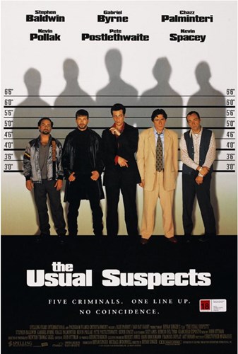
12. The Usual Suspects (1995)
After Kevin Spacey had approached director Bryan Singer and expressed an interest in working with him, Singer went to work on finding an idea. The very first thing to pop into his head during the creative process was this poster – five shifty looking guys in a police line-up. But what was their connection? What happened to get them there? What happens next? The Usual Suspects as we know it stemmed from that original vision, so when it came out, there was no doubt in Singer’s mind that the poster would look like this.
Have you got a favourite film poster design that hasn’t made the list? Let us know! Until then…. Roll credits.


