(1).png)
Choosing a font for your business is a decision not to be taken lightly. It might seem pretty menial in the big scheme of things, but you’d be surprised how important it really is, to the point where, in some cases, it can make or break a company.
Whether it’s for your logo, marketing materials or website, your font choice should reflect how you want to be perceived as a brand. While we can’t tell you which fonts would best suit both your brand and your taste, we can give you a few examples of the practices to stay away from if you want to get the most from your lettering…
1. Blink and You Miss It
No one likes a font that you can’t read. It might be fancy and it might look slick against your website design, but if you have to squint to read it, there’s no use it being there. This is especially important when it comes to your marketing materials. Potential customers aren’t going to spend time trying to decipher the text on your flyers, poster design, business card or roller banner, so make sure you promote your service using a clear, easy-to-read font.
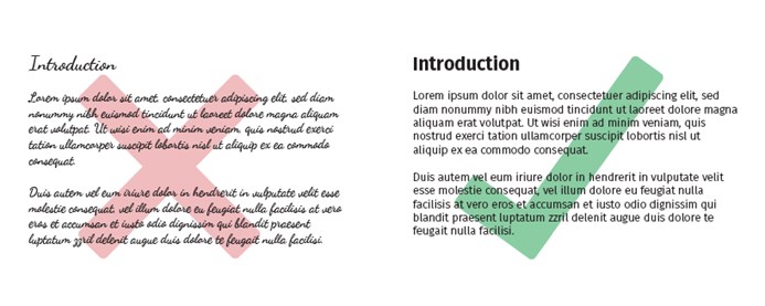
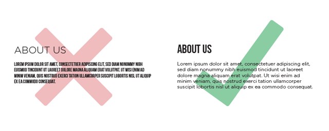
2. Unfit for the Job
One of the biggest mistakes you can make when choosing a font is forgetting to consider its purpose. The general rule of thumb with any sort of design is to make your header a different font to your body text so that readers can easily distinguish between the two. For the body text, opt for something simple that people can skim read. Using a scrawling, faded or squashed font is likely to put readers off. For the header, use something that’s bold, striking or perhaps even decorative, just as long as you’re careful not to overuse it; you don’t want your design to become cluttered and unclear.
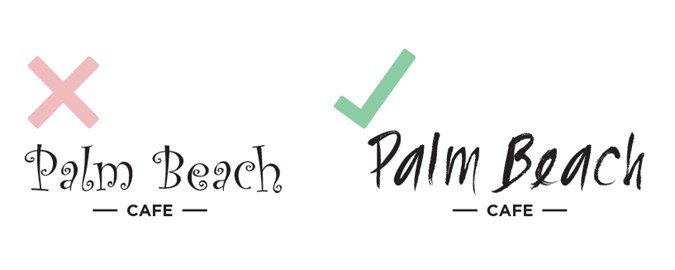
3. Child’s Play
While they might have been fun to use at school, characterised, cartoon-like fonts are big no-no if you want your brand to be taken seriously. Steer clear of fonts such as Jokerman, Papyrus and Curlz MT, they look cheap and amateurish and will make your company look that way too.
4. What a Pair of Fonts!
An unwritten rule when branding your company is to pair up two different fonts and stick to them. For example, all headers on your website will be one font, while the product copy, blog text, etc. will be another. Try not to choose fonts that don’t complement each other, the best results are often achieved by pairing a serif font (for headers) with a sans serif font (for body text). You want your brand to come across as clear and consistent, so make sure your chosen fonts comply with this.
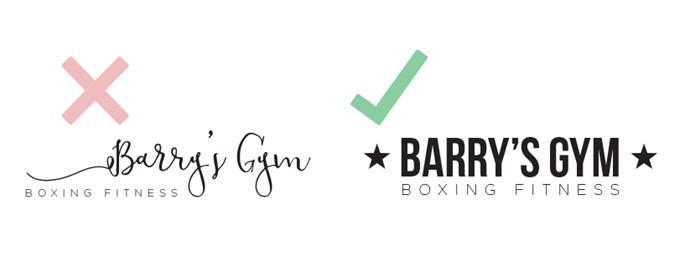
5. Now That's Inappropriate!
When it comes to the style of your font, go for one that will best suit your content and that is most appropriate for your audience. Your font should convey what your company is about. If you’re branding a boxing gym, choose something that signifies strength and substance such as Bebas or Steelfish (that one even sounds hard!). If you’re promoting a charity fun run, choose something upbeat and encouraging like Alfa Slab. Although it’s tempting to choose a font based on your own personal tastes, it’s best to opt for the one that offers the right impression to customers.
6. Fonts Behaving Badly
If you’ve spent any time looking at fonts online, you might have stumbled across a few examples of when fonts turn bad! This is when the reader misinterprets the message as something else (usually something rude or inappropriate!) due to the font being squashed together or presented in an unfortunate fashion. The results are often hilarious, but it’s not something that should be repeated by your own company! To keep your font from behaving badly, always make sure you allow space for your letters. Think about where the text is going to be seen and how it will look on a whole. The lesson here is to proof-read like mad! You could even ask someone unrelated to your company to check over your design and see if it reads as intended. The last thing you want on your hands is a font blooper, your company might not live it down!
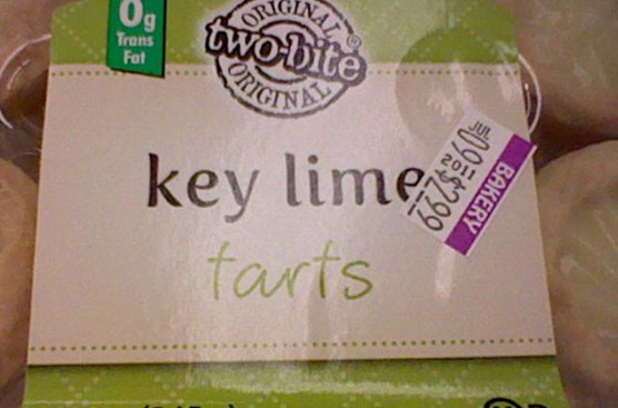
Image: www.thefw.com
So now you know your good fonts from your bad fonts, it should make sifting through the endless pool of options a lot easier. If in doubt, just keep it simple and whatever you do, keep away from Comic Sans. It’s never, ever the answer!
Have you ever come across a bad font choice that has made you recoil in horror? Let us know!