(1) (1).png)
Whether we are aware of it or not, we read a lot from the colours we see. In a fraction of a second, we can make a subconscious judgement on a product or brand, just by taking in the colours used. Red can evoke emotions of urgency, whereas blue can make us feel relaxed and serene. Choosing the right colour palette for your project is a science in itself. Not to mention that personal and cultural preferences vary widely; a palette that is successful with one group of people may be a complete turn off to another!
We did some research into colour theory to give you a helpful guide to choosing the perfect palette.
Which Colours Complement Each Other and Why
![]()
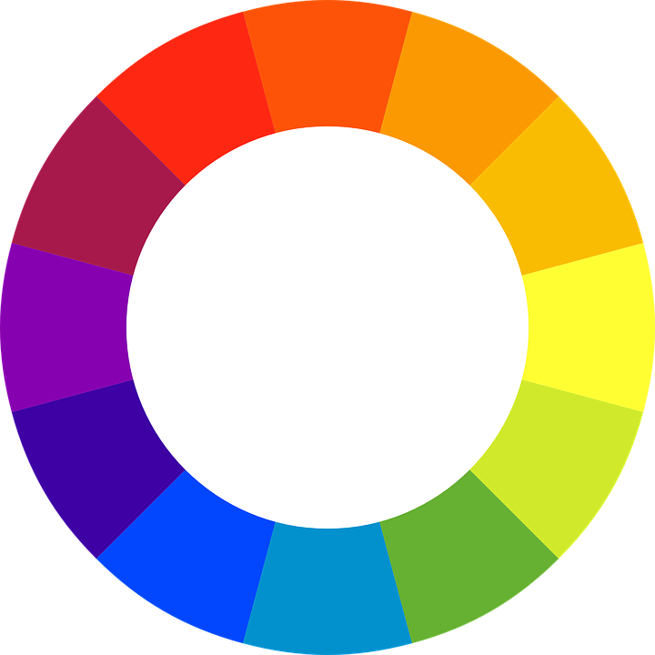
A colour wheel is a great start when making basic colour choices. According to colour theory, colours that are opposite each other on the colour wheel go well together – these are known as complimentary colours. You can also choose three colours that are equally spaced around the wheel to give you a split-complimentary colour scheme. Furthermore, three colours that are next to each other on the colour wheel are called analogous colours. All of these combinations should result in a pleasing colour palette.
In addition to this, the wheel is split into warm and cool sections. Blues and greens being cool, and reds and yellows warm. When choosing a colour scheme for your project, consider whether you would like to convey happiness and energy (warm) or calmness and professionalism (cool).
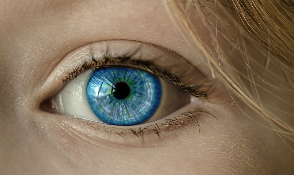
The scientific reason why these colour combinations appeal to us is down to the different types of photoreceptor cells in our eyes. Different photoreceptor cells perceive different colours on the spectrum.
In design, this means that complimentary colours are so effective because they simultaneously appeal to various parts of your eye – it is pleasing to see orange next to blue, purple next to yellow, etc.
![]()
How to Make Colours Fit with Your Audience
Before choosing the right colour palette for your audience, first decide what you want to say about your business. The viewer will most likely make split-second decisions based on the colours they are presented with, so you want to ensure they are getting the right impression.
Erin O'Donnell, Senior Director of Digital Experience at Sparxoo, discussed how colours can be used to influence your audience;
‘‘Choosing colours for your brand is far more than an exercise in creating visual appeal, colour has the power to impact everything from how individuals feel about your brand, to user experience. Pick colours that align with what you want to *say* about your brand and then apply them consistently across your print and digital properties. When applied appropriately, colour can actually be used as a tool to influence and persuade.’’
It is also useful to take a look at your competitors and analyse what colours they have used in their marketing materials. In our previous post, The Psychology of Colour, we detailed the personality traits companies convey with the colours they use in their logos. The BBC choose a bold shade of red for their main logo, but a bright pink for their BBC iplayer counterpart. This could suggest they want to be seen as hard-hitting industry leaders for their main news channels, but fun and youthful as their iPlayer alter-ego.
Finally, analyse the type of people you are targeting. Are they fun and vibrant or calm and professional? It is important to consider both the personality of your company and of your target audience. We spoke to Shantini Munthree, Managing Partner for The Union Marketing Group about how they choose a colour palette for a brand;
‘‘While it may appear that choices are boundless, choosing the right colours for a brand narrows quickly using a few criteria. At our company, we start with the industry to explore the expected aesthetic. We then look at the brand, it's mission and personality to assess how we position the brand visually in the chosen industry. Colour choice lies on a spectrum of the expected and the new.’’
![]()
Sample Colour Palettes
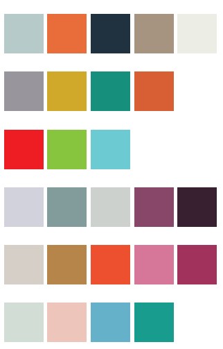
Now you have identified some colours that fit in with your brand's personality, it’s time to decide on an appealing palette. We have selected a range of colour palettes to give you some inspiration.
The colour combinations below are both pleasing to the eye AND suggest a personality. For example, the first colour palette is both calm and professional – featuring neutral shades with a splash of muted orange. In contrast, the third colour palette is bright and fresh, suggesting a younger and more vibrant brand.
We hope this has helped you on your way to choosing a colour palette for your business or project, but if all else fails, you can always rely on our pre-designed templates to show your business in the best light!
Do you have a great colour palette for your business? Seen a wonderful use of colour elsewhere? Let us know on Twitter or Facebook!